eSIM UX Audit
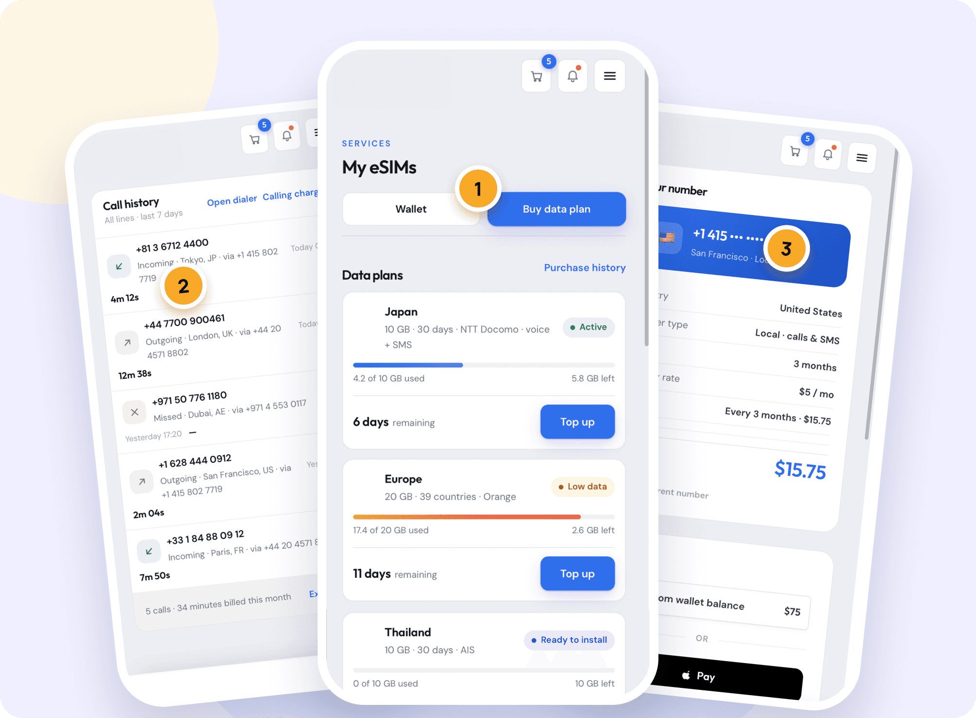
A full UX audit of a mobile product that combines virtual phone numbers, travel data eSIMs and Voice + Data eSIMs, turning complex functionality into a clear redesign direction.


- Duration
- 1 Week
- Industry
- Telecom, Travel Tech, Consumer Mobile
- Team
- 1 UX Designer
- Scope
- 2 personas, 2 journey maps, 4 competitors
About Project
General information
eSIM is an all-in-one telecom app: users buy virtual phone numbers for WhatsApp, calls and verification, travel data eSIMs for 190+ destinations, and Voice + Data eSIMs that combine both. The product already had a strong brand and a lot of functionality. But users had to process too much information, compare unclear plan types and make too many decisions before paying.
The eSIM team asked Creava to find where the experience loses people and to define a clear direction for the upcoming redesign.
Deliverables
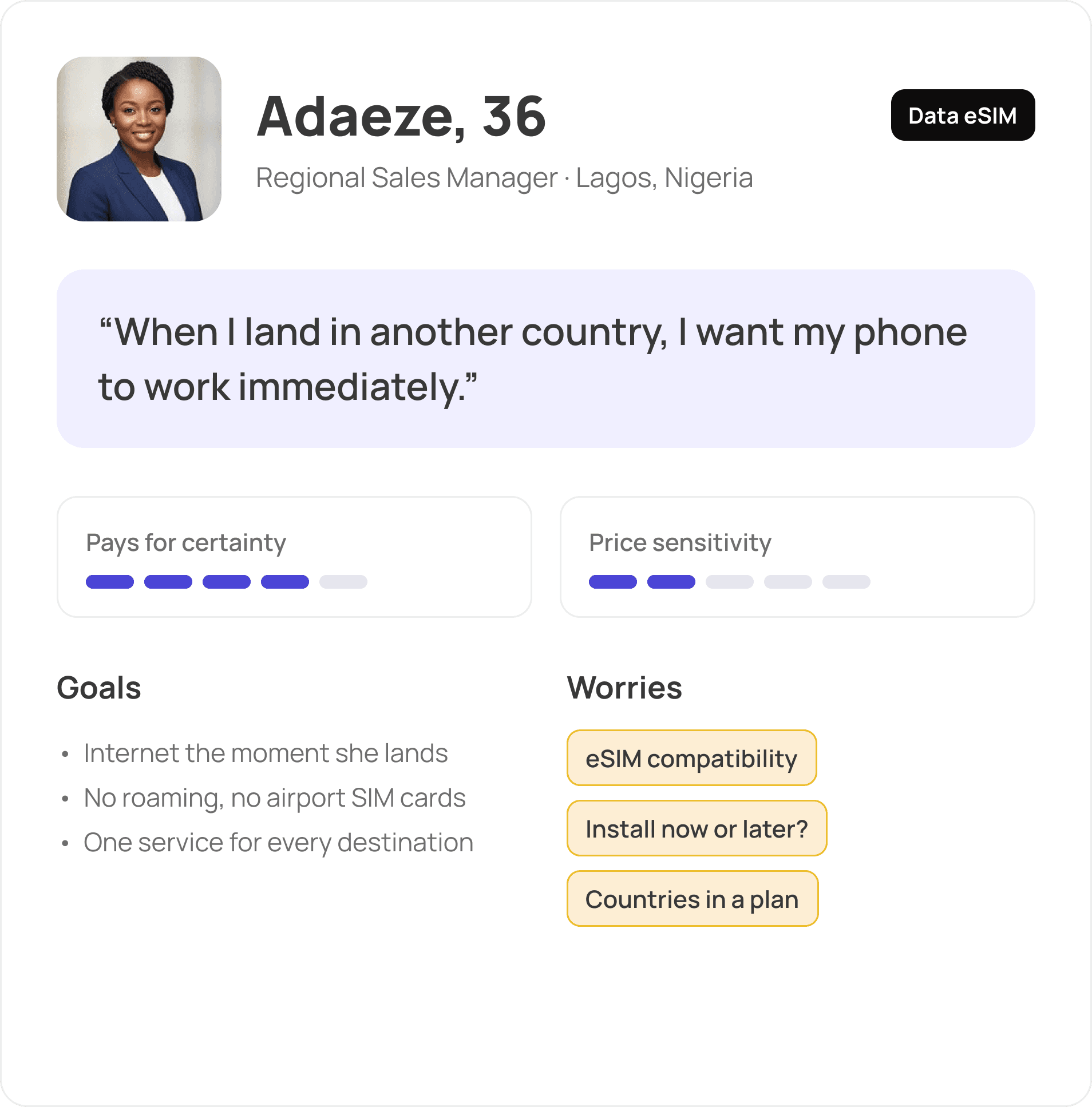
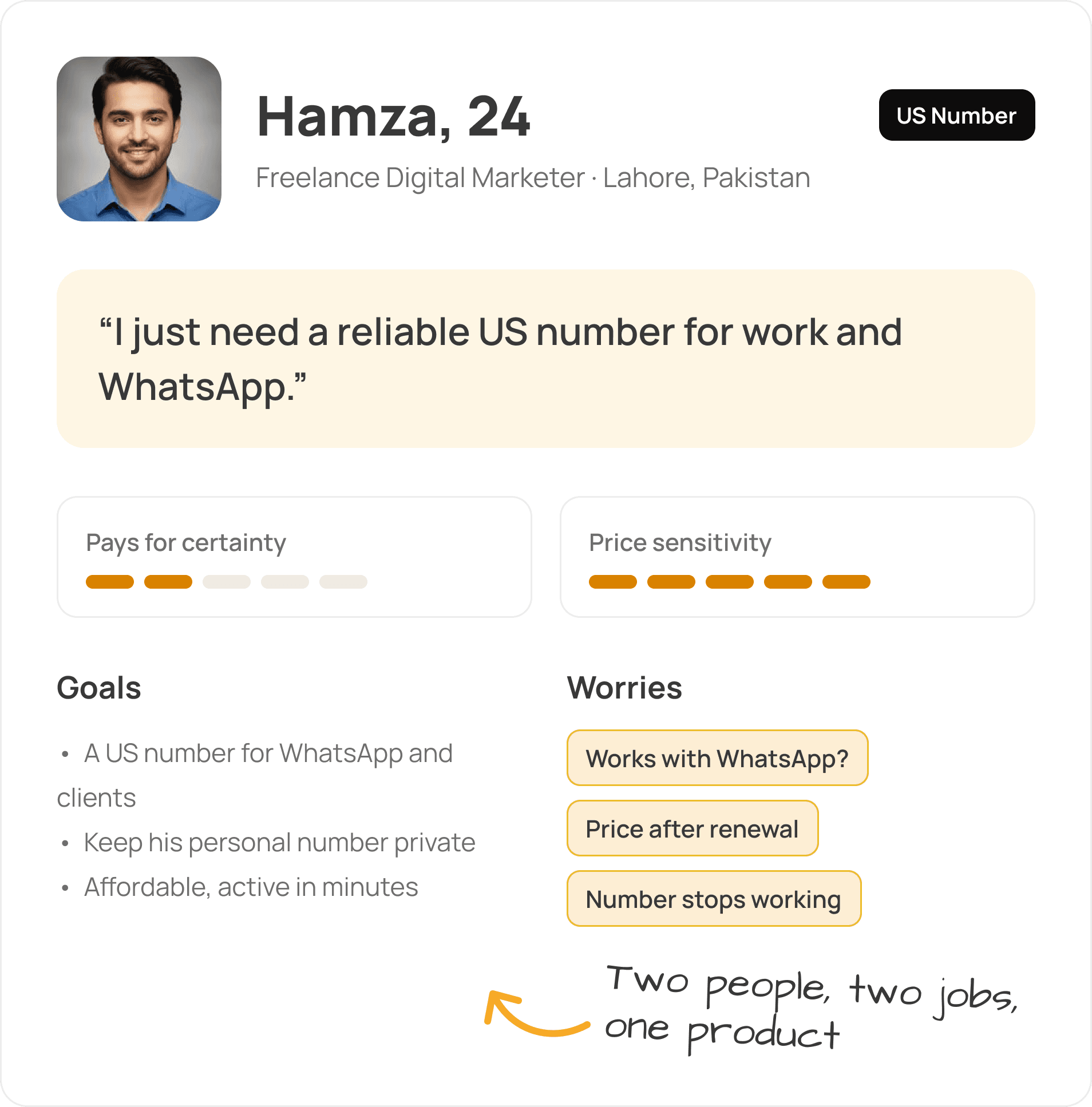
2 user personas: a business traveller and a freelancer who needs a US number
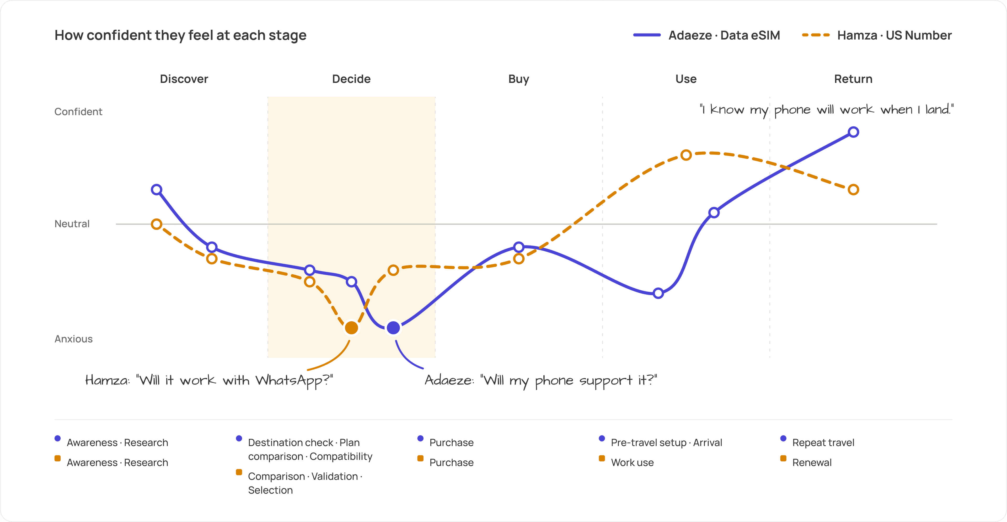
2 User Journey Maps covering 17 stages from awareness to retention
Competitive audit of 4 direct competitors across 14 criteria
Screen-by-screen UX/UI audit: what works, what to improve, how to improve
Final conclusion with product hierarchy, visual direction and 5 redesign priorities
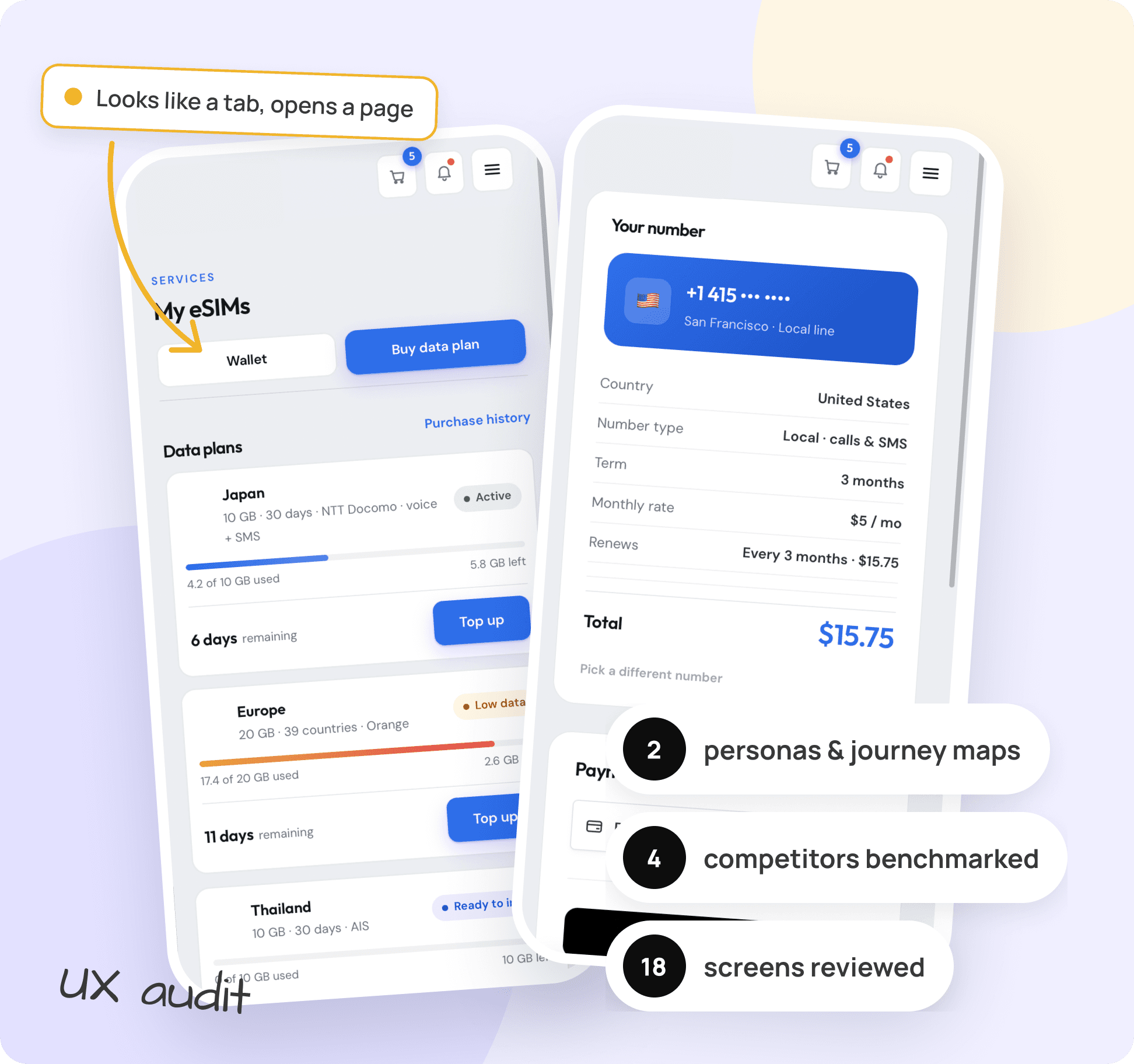
Problems & solutions
- UX
1. No clear product hierarchy
Virtual Numbers, Data eSIM and Voice + Data eSIM competed for the same attention. Users faced decision fatigue before they understood what eSIM offers.
Solution:
We defined a three-level hierarchy. Virtual Numbers lead the experience, Data eSIM stays visible as the secondary core, and Voice + Data is framed as the differentiator that sets eSIM apart from data-only providers.
- UX
2. Plan types were hard to tell apart
Both personas struggled with telecom terms: Data Only vs Voice + Data, number types, and which countries a regional plan covers.
Solution:
Plain-language plan cards that show data, validity, coverage and support for calls, SMS, WhatsApp and verification at a glance, plus a visible country list before purchase.
- UX
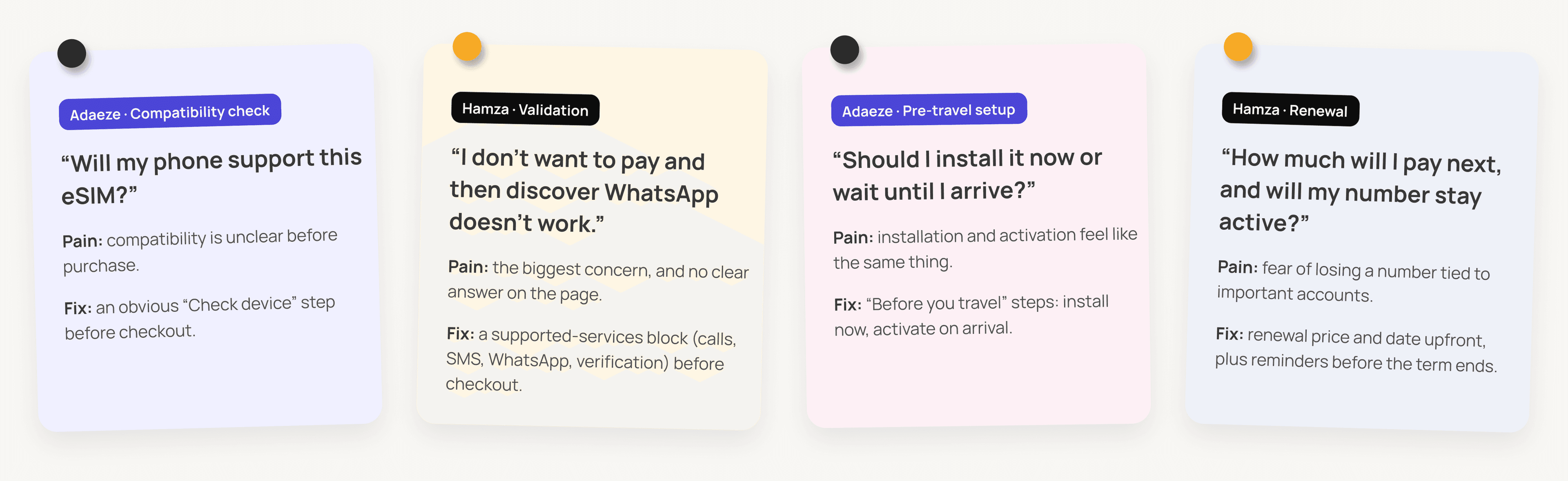
3. Fear of hidden costs
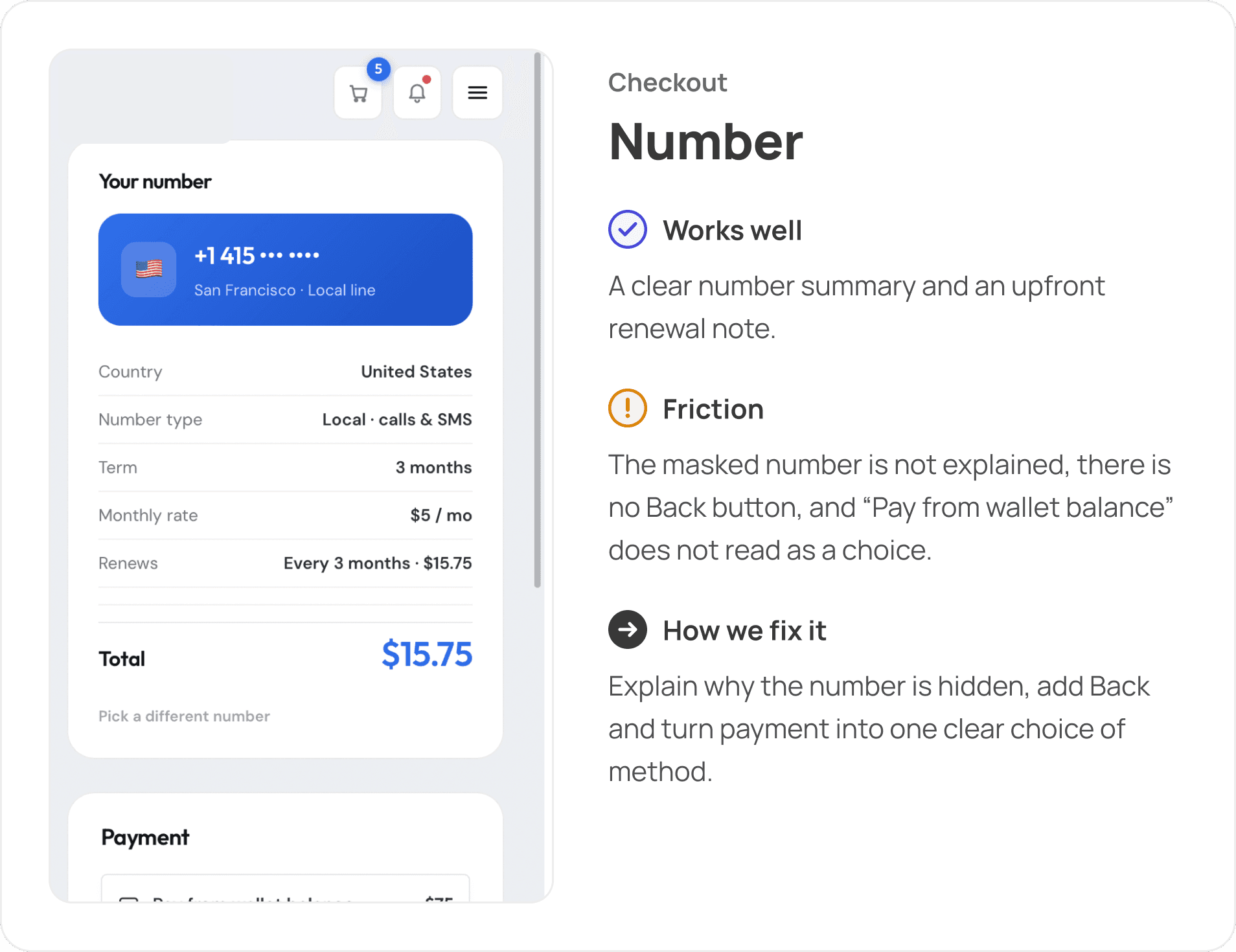
Low advertised prices, unclear renewal terms and odd lines like "Delivery · Free" for a digital product reduced trust right before payment.
Solution:
Show the final price, renewal price and activation rules upfront. Keep the "$15.75 today, then every 3 months" pattern and remove delivery wording from the order summary.
- UX
4. Checkout with too many distractions
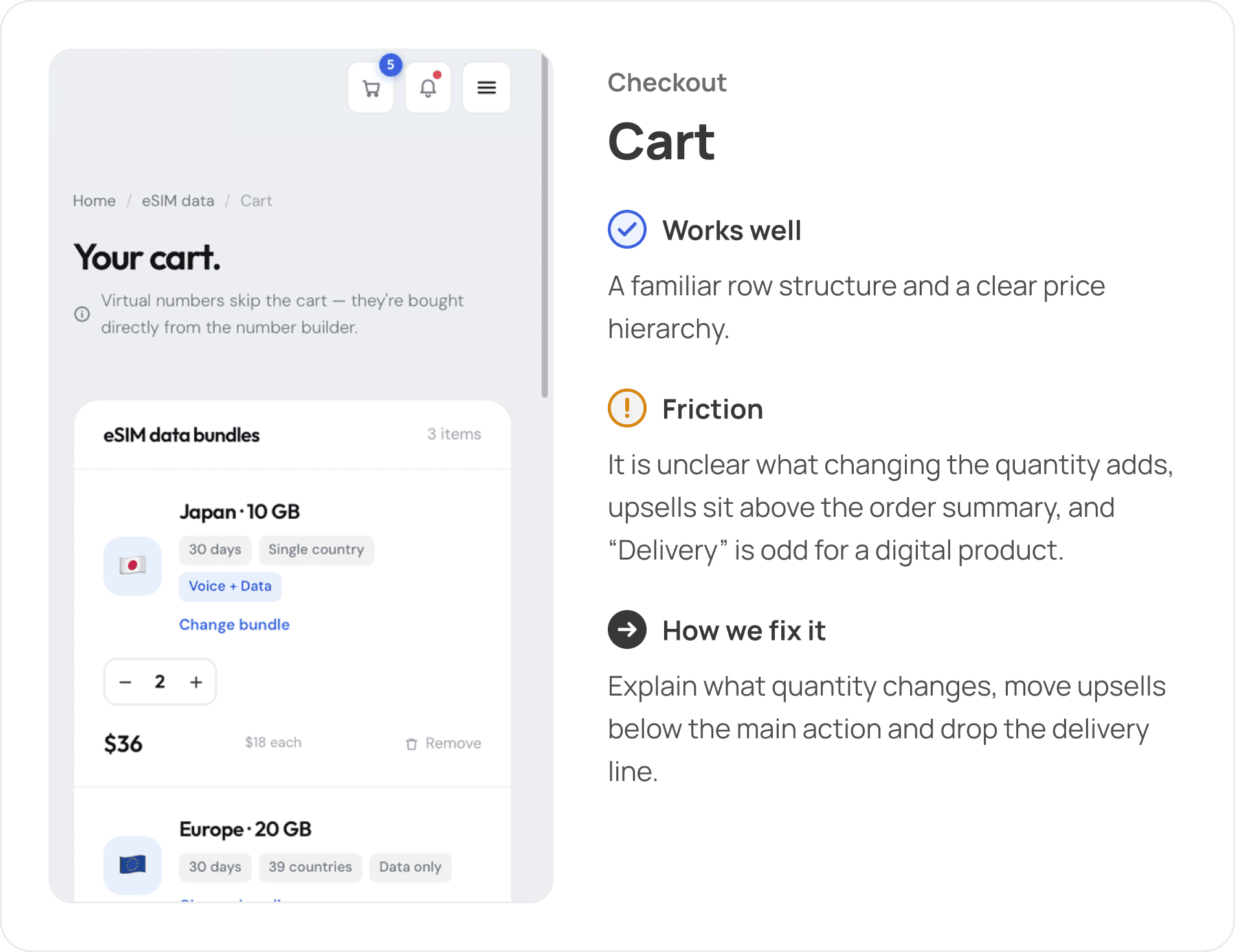
An "Add another destination" block sat above the order summary, there was no Back button, the masked number was not explained, and "Pay from wallet balance" did not read as a selectable option.
Solution:
Move upsells below the main action, add clear navigation back, explain why the number is hidden until payment, and restructure payment into one clear choice of method.
- UX
5. Overloaded account area
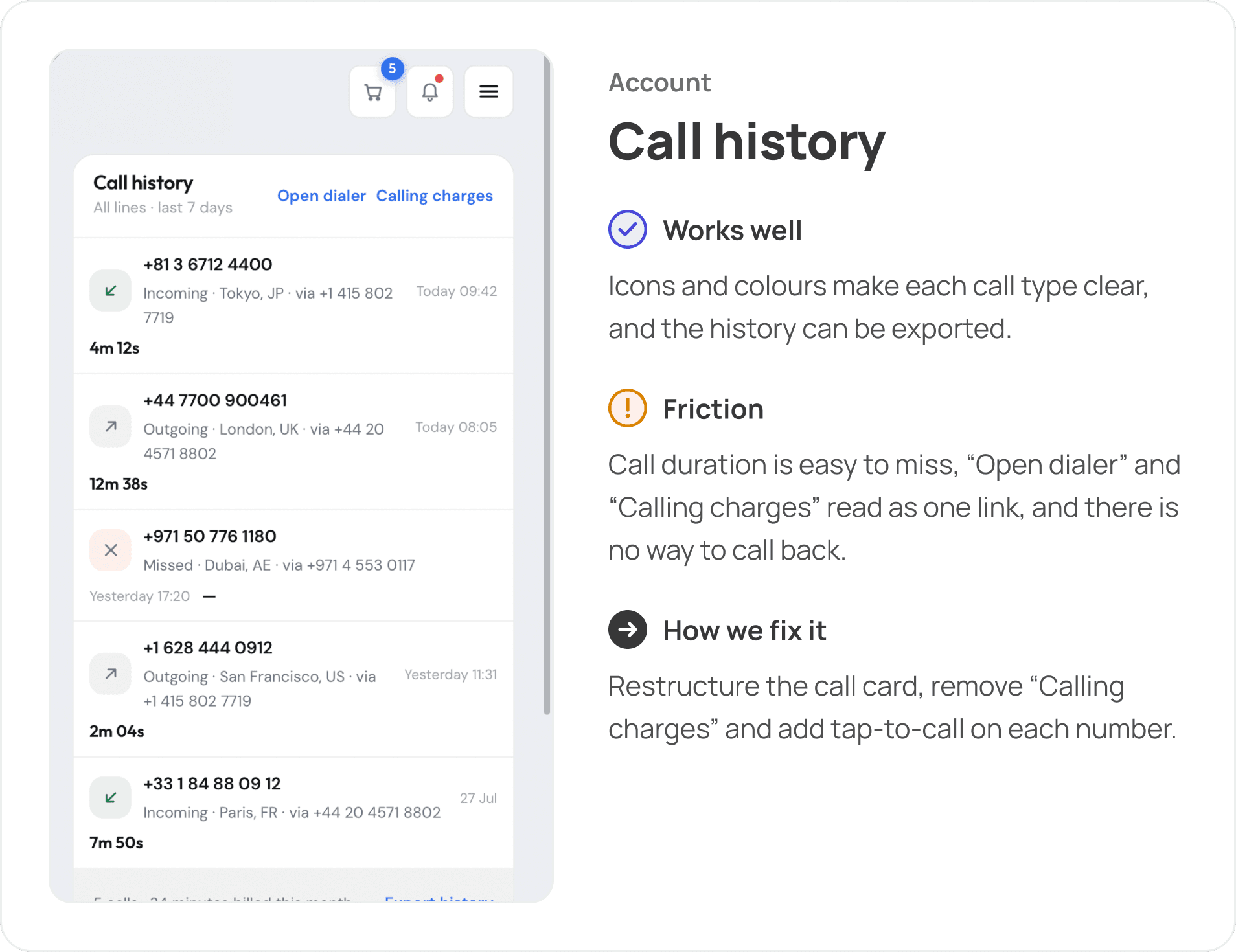
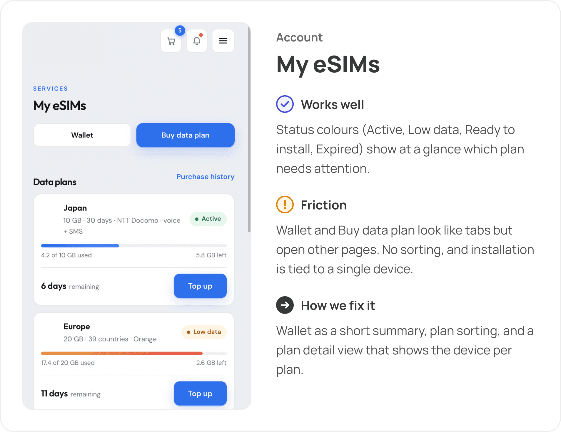
Account settings stacked seven sections on one page. My eSIMs had no sorting and tied installation to a single device. Call history hid call duration and did not allow calling back.
Solution:
Split settings into three tabs (Profile & data, Security & notifications, Plan & payments). Add plan sorting and drill-down with device info per plan. Restructure call cards and add tap-to-call.
- UI
6. Inconsistent UI, dark-market sameness
Spacing, button styles and states varied between screens, and most competitors use dark, heavy interfaces.
Solution:
A light-first UI system built on the existing brand: rounded containers, bento-style sections, consistent interaction states and contrast that stays readable in direct sunlight.
Personas
eSIM serves two very different jobs: staying connected abroad and getting a second number for work. We built a persona for each to see where their needs meet.

User Journey Maps
We mapped 17 stages across both personas and plotted how confident they feel at each step. Both hit their lowest point before paying, while they’re still trying to work out whether the product will work for them.
Competitive Audit
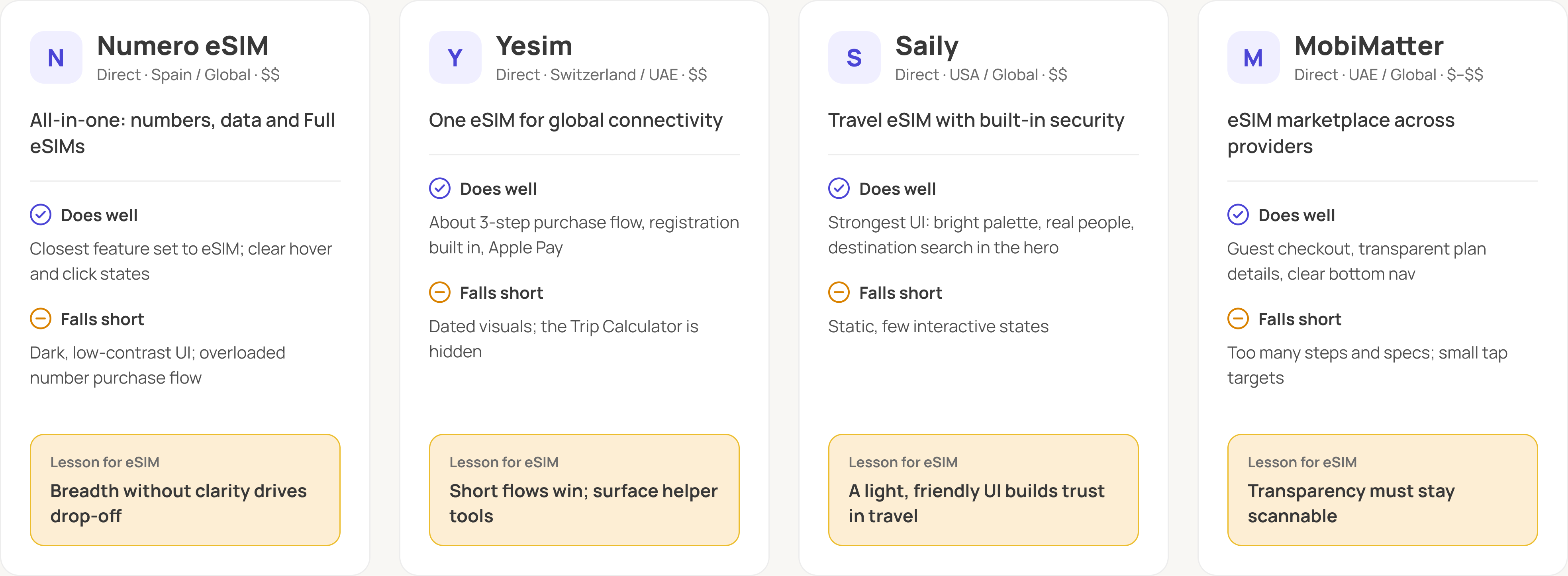
We compared 4 direct competitors on 14 criteria, from value proposition and accessibility to user flow, navigation, brand and tone.
Proposed user flow
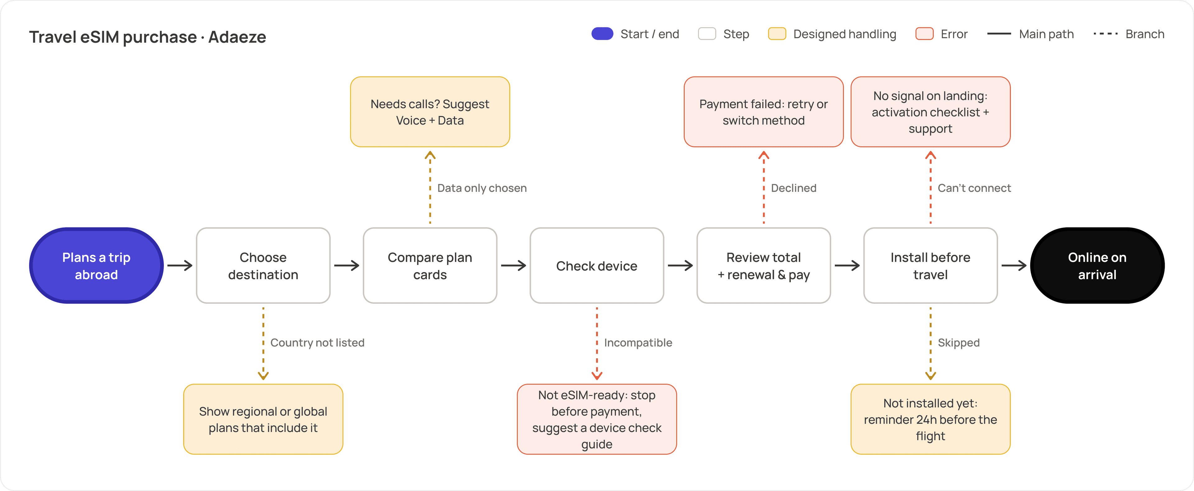
Buying a travel eSIM after the redesign: one straight path from destination to connection, with coverage, compatibility, price and installation answered before the user lands.
Audit Process

Discovery
Reviewed the product, its three offerings and the business goal behind the redesign.

Personas
Built two personas from the main use cases: travel connectivity and a second number for work.

User Journey Maps
Mapped goals, actions, thoughts, pain points and opportunities across 17 stages. 2.

Competitive Audit
Benchmarked Numero eSIM, Yesim, Saily and MobiMatter on UX, visual design and content.

Screen-by-screen audit
Reviewed key screens in a "What works well / What could be improved / How to improve" format.

Conclusion & handover
Summed up product hierarchy, visual direction and 5 redesign priorities as the brief for the redesign.
Recommended Visual Direction
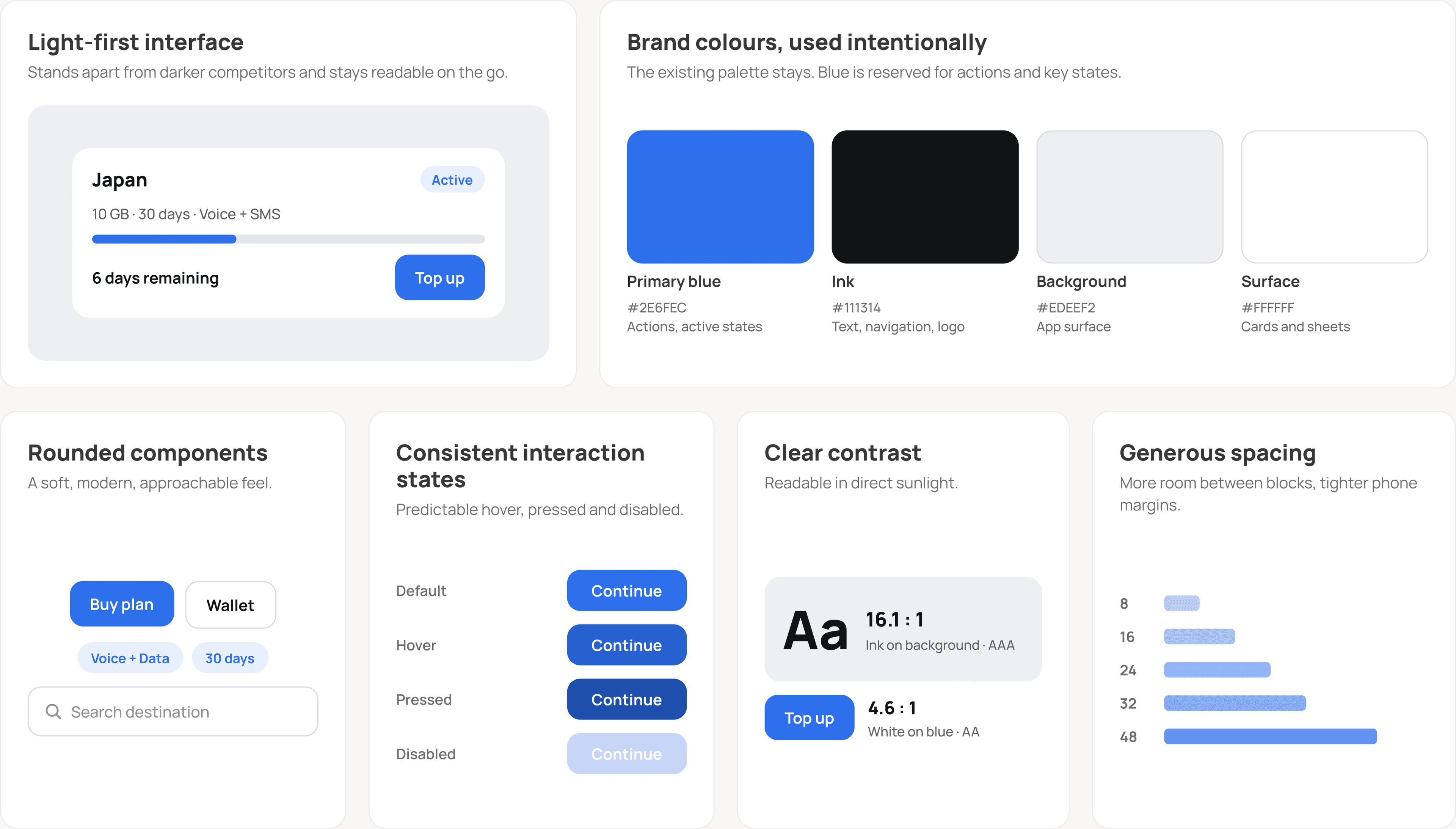
We recommended evolving the existing brand rather than replacing it. The logo, typography and core colors already fit the telecom and travel space; the UI around them needed a consistent system.
Light-first interface: stands out from dark competitors and stays legible on the go.
Rounded components: a soft, modern, approachable feel.
Bento-style structure: groups diverse utilities (plans, wallet, numbers) into clear blocks.
Brand colors used intentionally: reserved for key actions and states; the dark logo tones go to accents and navigation.
Clear contrast: a type scale readable in direct sunlight.
Consistent interaction states: predictable hover, active and focus.
Generous spacing: tighter side margins on mobile, more room between blocks.
Screen-by-Screen Audit
Each screen got the same three-part review.
Audit Outcomes
The audit gave the eSIM team a clear brief for the redesign: keep the power of an all-in-one telecom product, and make it feel simpler, clearer and more trustworthy.

2
Personas & journey maps

4
Competitors benchmarked

18
Key screens audited

5
Redesign priorities