Resident Services & Social Impact Platform
Ounce is a comprehensive ecosystem for social workers, nonprofits and healthcare coordinators. It helps them manage residents and benefit programs, communicate across channels, coordinate community resources, track population health and measure social impact.
- 200 Hours
- 1 Designer + Product Owner


- Duration
- 200+ Hours
- Industry
- Healthcare \ Social Services \ SaaS
- Team
- 1 Designer + Product Owner
- Scope
- Product Design, 120 screens
About Project
General information
The client reached out to us to create the platform from scratch. Ounce helps social workers, care coordinators and healthcare organizations manage residents, their benefits, services, health and communication.
The goal is to improve the quality of life for residents in affordable housing by simplifying the work of organizations that provide medical, social and financial assistance.
Deliverables
Design a complete platform from scratch, 120 screens
Bring residents, benefits, communication and resources into one workspace
Design the AI assistant "Ounce of Support" and AI-generated replies
Build impact analytics for properties, population health and resident insights
Create a design library and prepare the development handover
Problems & solutions
The Ounce project revealed six key challenges that shaped our UX/UI approach and the solutions we designed.
- UX
1. Daily work spread across too many tools
Social workers handle residents, benefit applications, messages, events and reporting every day. Without one place for it, key tasks get lost and admin takes time away from people.
Solution:
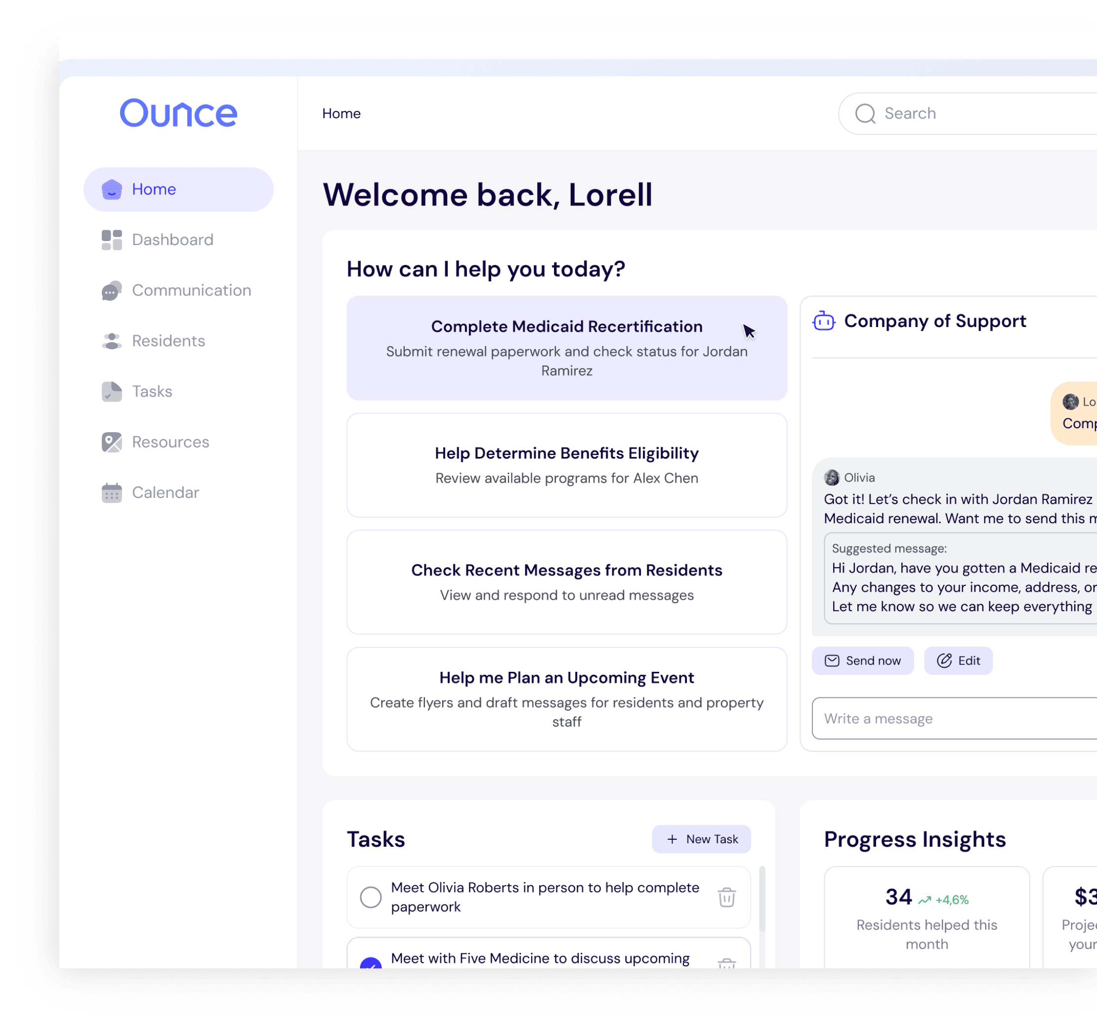
Home became a central workspace: quick actions for Medicaid recertification, eligibility checks, new messages and events, plus a task list and progress analytics on one screen.
- UX
2. Many benefit programs, many rules
Residents apply to SNAP, Medicaid, WIC, LIHEAP, SSI, TANF and other programs, each with its own process. Coordinators need to see where every application stands.
Solution:
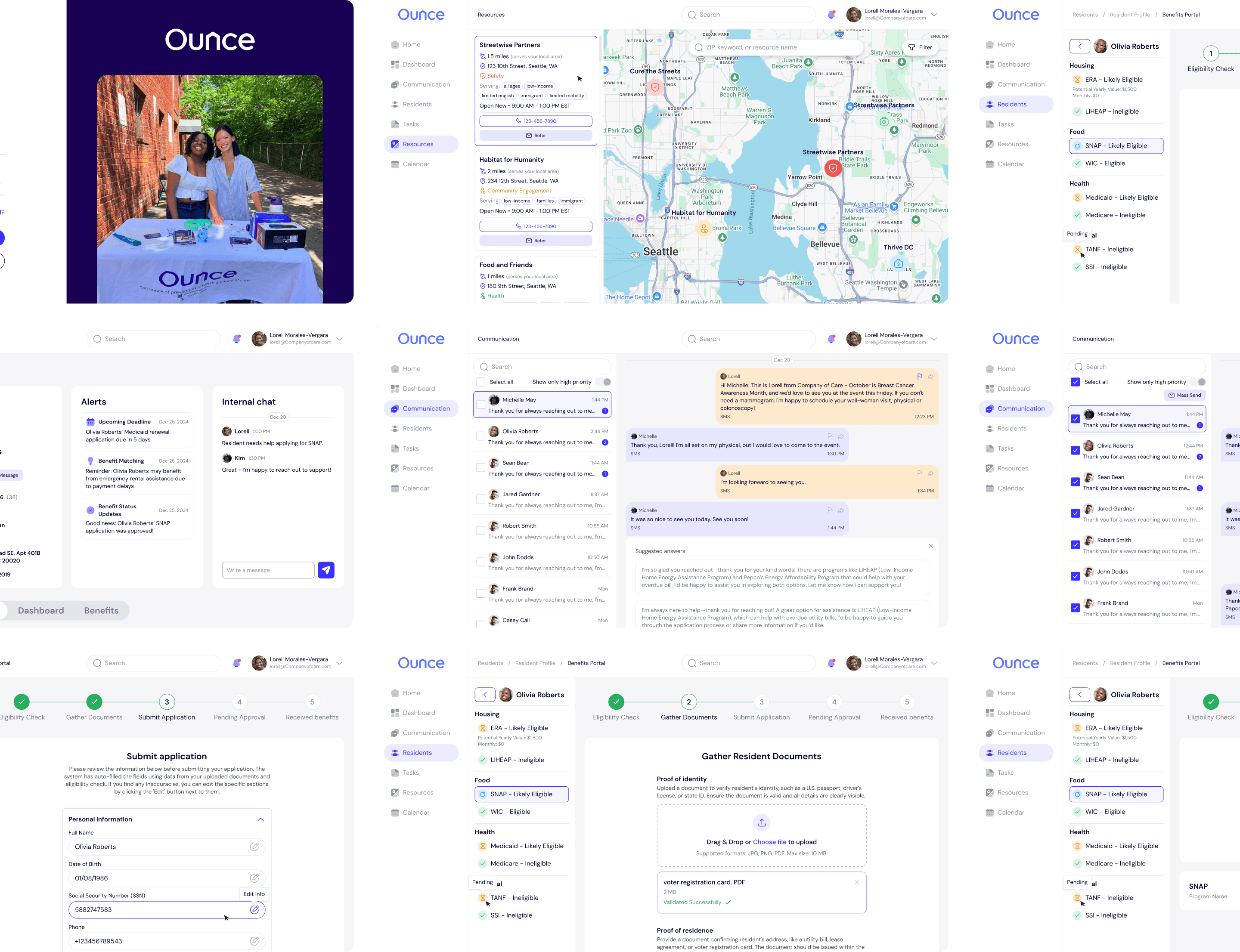
The Benefits Portal automates the process end to end, from eligibility check to approval. Each resident profile shows benefit status as likely, approved or ineligible.
- UX
3. A complete picture of each resident
Interactions, services, benefits, health and personal goals lived in different places, so it was hard to understand a resident's situation quickly.
Solution:
A resident database with last interaction, services received, available benefits and goals. The profile adds tabs for recent communications, a personal dashboard and benefits.
- UX
4. Communication across channels
Coordinators talk to residents by SMS and email, and urgent messages can get buried among routine ones.
Solution:
One Communication hub with all conversations in a sidebar, SMS and email in the same chat, High Priority and Forward actions, filters, and an AI "Generate Reply". The "Ounce of Support" assistant suggests ready-to-send templates like Medicaid renewal reminders.
- UX
5. Coordinating community resources
Partner organizations, events and staff activities needed to be easy to find and plan, so residents get the right help at the right time.
Solution:
Resources show partners on an interactive map with detailed cards, ZIP and service filters and direct referrals. Calendar and Tasks plan events, track statuses and flag priorities.
- UI
6. Proving social and economic impact
Organizations and partners need to see program effectiveness, but impact data across properties, health and engagement is complex.
Solution:
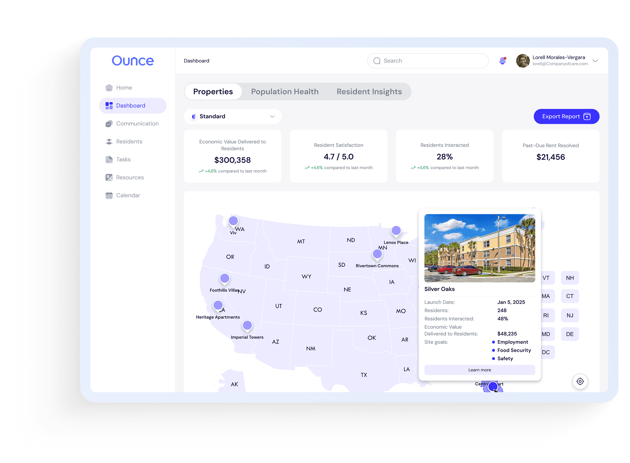
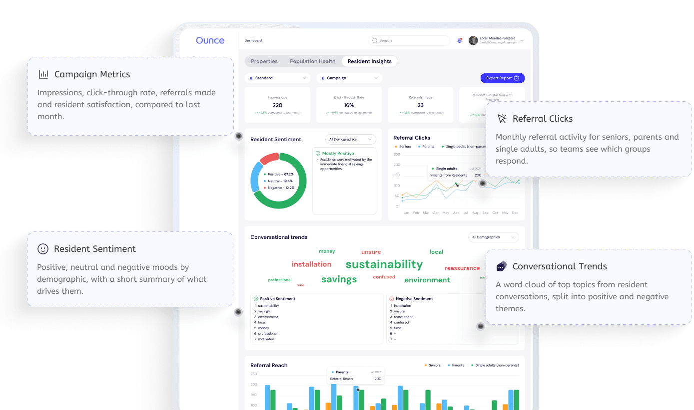
Three dashboards: Properties with a U.S. map and economic impact, Population Health with care gaps and recommendations, and Resident Insights with sentiment and conversation trends.
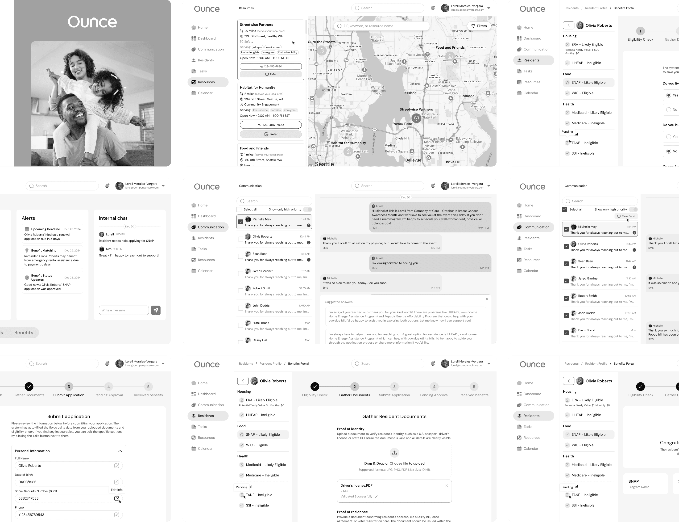
Wireframes
We structured the platform around eight modules that cover the full cycle of resident support, from first contact to measurable impact.
Design process
We worked closely with the Product Owner at every stage to align goals, clarify requirements and validate assumptions.

UX audit & research
A comprehensive UX audit and competitor analysis to identify market standards and opportunities, plus a User Journey Map and User Flow.

High-fidelity wireframing
Detailed wireframes to define the structure, layout and functionality of each screen before UI design.

UI design using components
A consistent UI built on reusable components for scalability and visual harmony across the interface.

Design library
Typography, color palette, icons and components to streamline updates and keep the product consistent.

Main screens prototyping
Interactive prototypes of key screens for stakeholder review and usability testing.

Development handover
120 screens with assets, specifications and documentation for a smooth and efficient implementation.
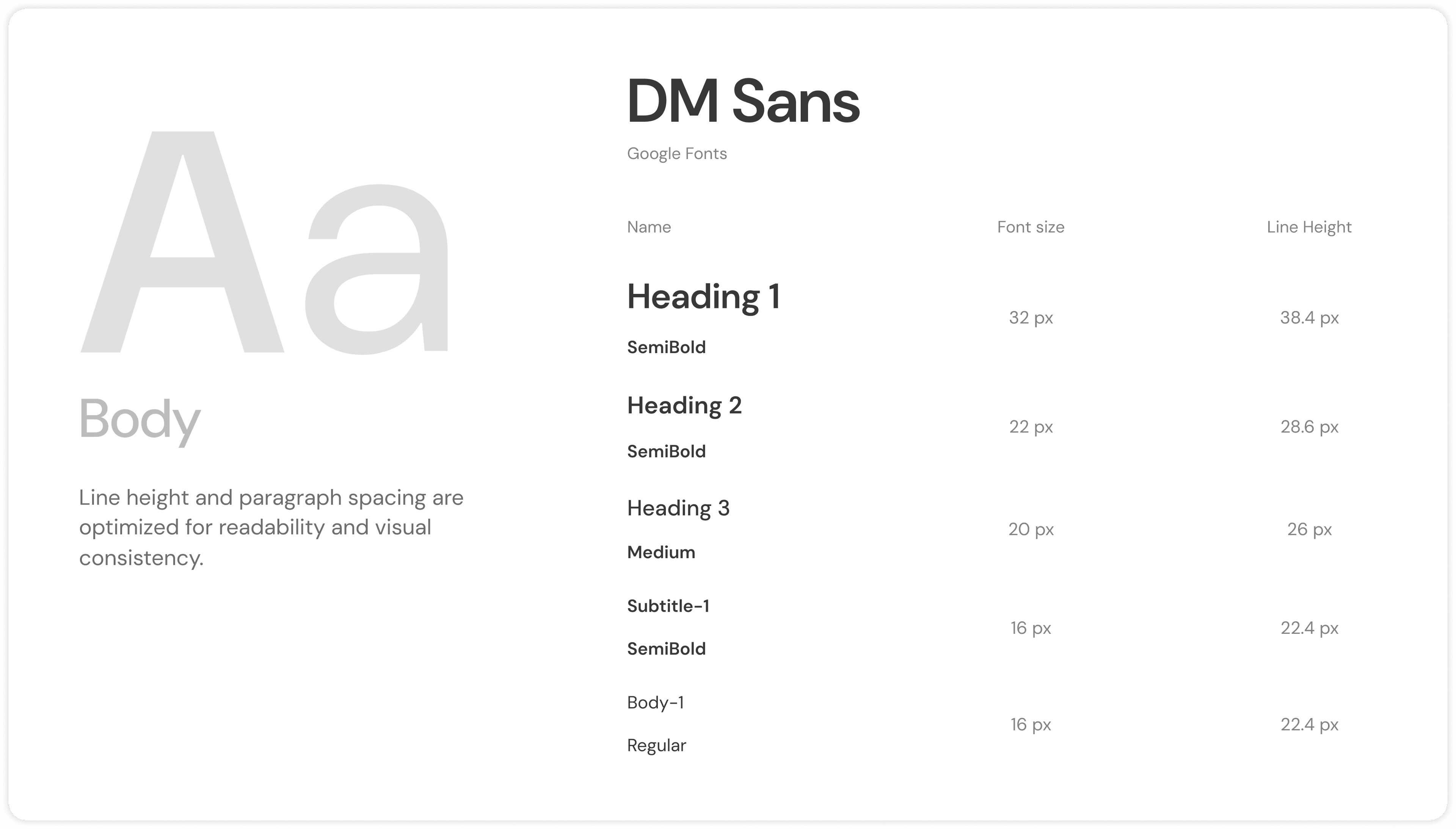
Project colours & typography
The visual system was designed to feel calm and trustworthy, supporting dense resident and health data while staying easy to scan for social workers.
- 3C33FF
- 000033
- FCA021
- F6F6F8
Key product screens
From daily work with residents to impact analytics: the main screens of a platform that brings benefits, communication, resources and health data together.
UI & elements
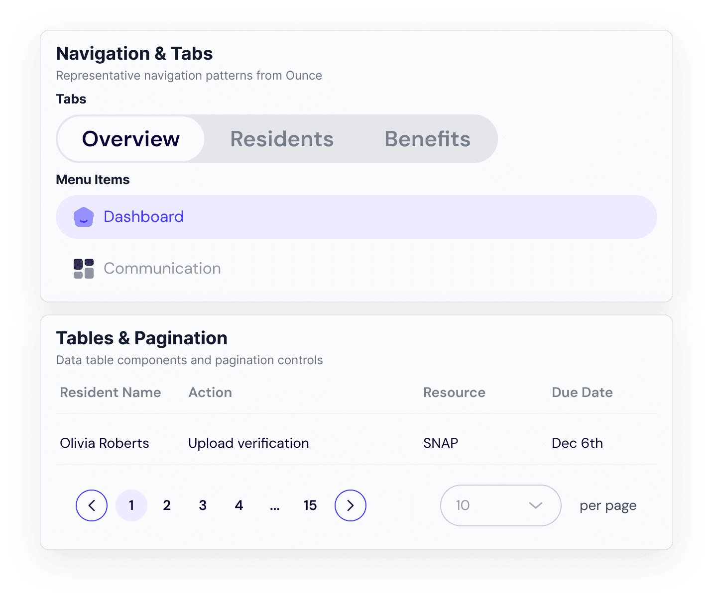
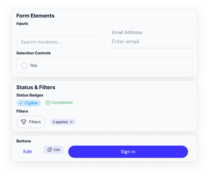
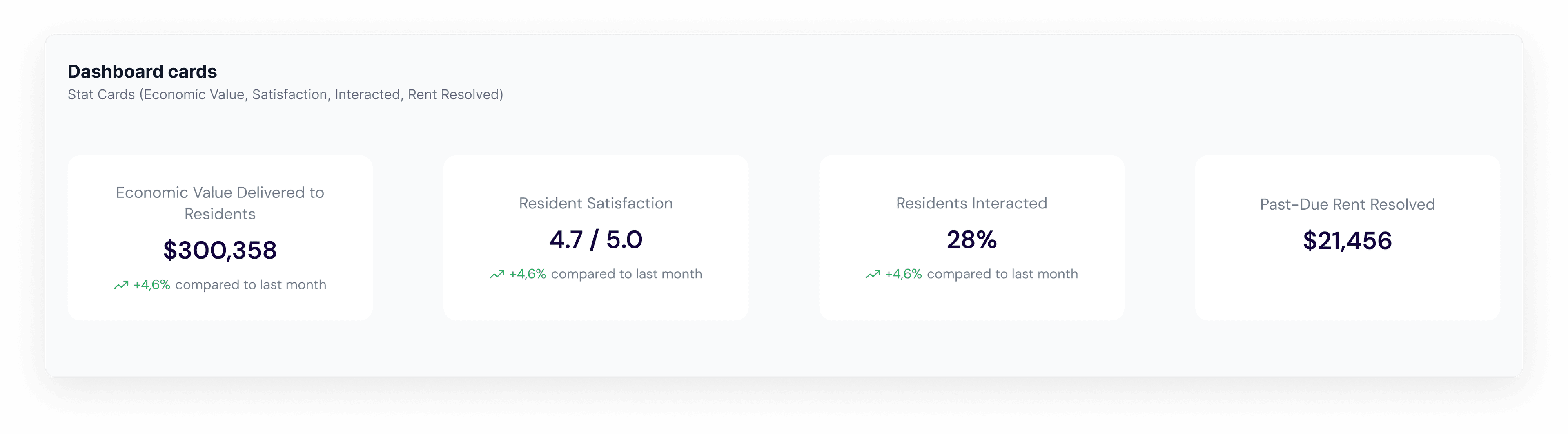
The Ounce design library covers typography, colors, icons and components: buttons, inputs, selection controls, chat elements, tables, filters, navigation and dashboard cards.
Product showcase
Resident Insights shows how residents engage with programs and how they feel about them. Campaign metrics, sentiment and conversation topics help organizations measure impact and adjust their outreach.
Design outcomes
The platform has been launched to the market and is actively used by social organizations across the U.S.


120
Screens
A complete platform designed from scratch, from Home to impact dashboards.

200h
Delivery
From UX audit to development handover, by 1 designer with the Product Owner.

8
Modules
Residents, benefits, communication, tasks, resources, calendar and analytics in one ecosystem.

Live
Across the U.S.
Launched to market and actively used by social organizations.