My eSIM
Reimagining global connectivity through seamless eSIM technology. A comprehensive design solution for modern travelers.
- 3 Weeks
- 2 Specialists


- Country
- USA
- Market Region
- USA
- Industry
- Travel
- Service
- Mobile App
About Project
General Information
The client already had a live eSIM app, but users struggled to find the right plan, install their eSIM and understand what they were paying for. The challenge was to redesign a technical product — data plans, networks, QR activation and device settings — feel as simple as buying a coffee, for travelers who often shop for a plan minutes before a flight.
Deliverables:
Audit the existing app and redesign it end to end
Make plan search and comparison fast across countries and regions
Turn eSIM installation and activation into a clear, guided flow
Design a Premium subscription that adds value without blocking core purchases
Build a wireframe system of reusable components ready for UI design and development
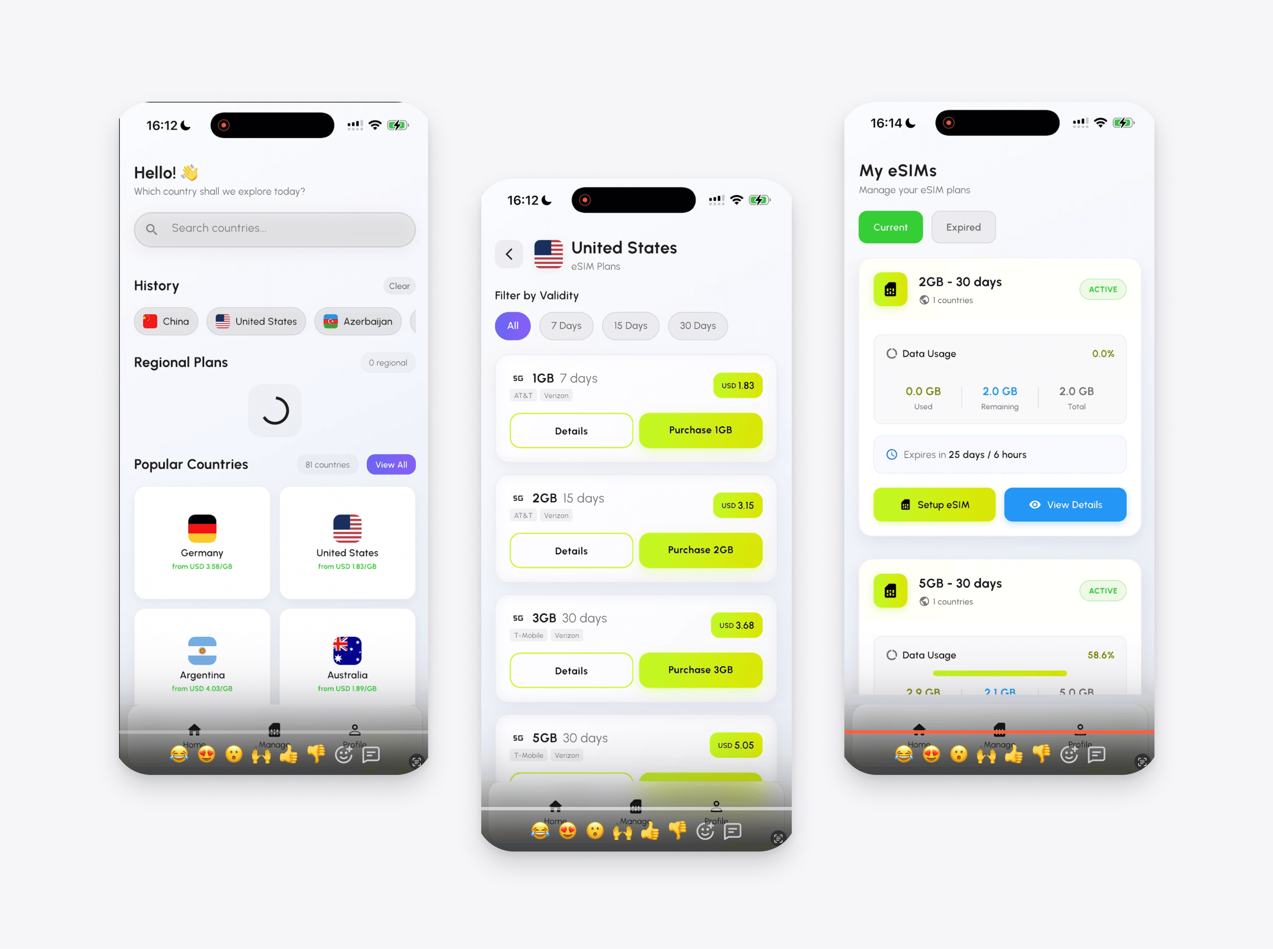
Before & after
The app helps users quickly find and activate the best eSIM plan based on their region, destination, and personal needs. The app helps users quickly find and activate the best eSIM plan based on their region, destination, and personal needs.
Problems & solutions
eSIM project revealed six key challenges that shaped our UX/UI approach and the solutions we designed.
- UX
1. Too Many Plans, Too Little Time
Travelers often buy an eSIM at the airport or right after landing. In the original app, hundreds of plans across 165 countries made choosing slow and confusing.
Solution:
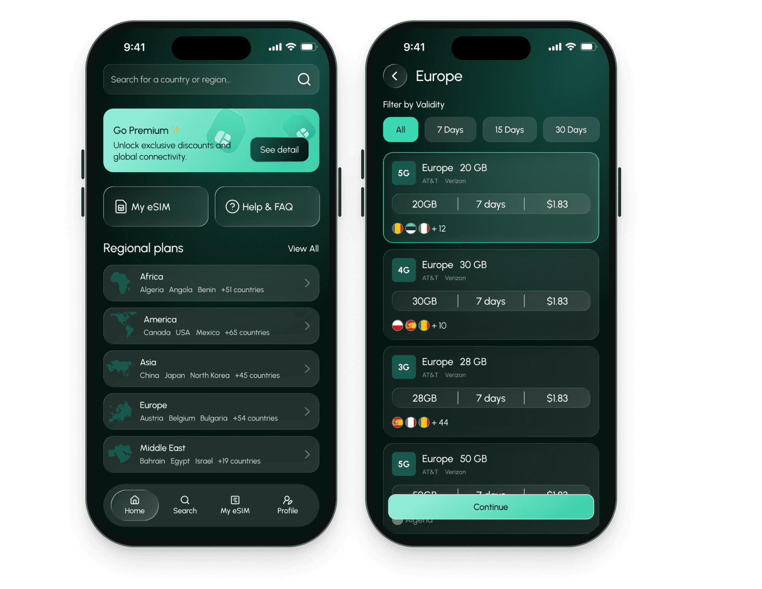
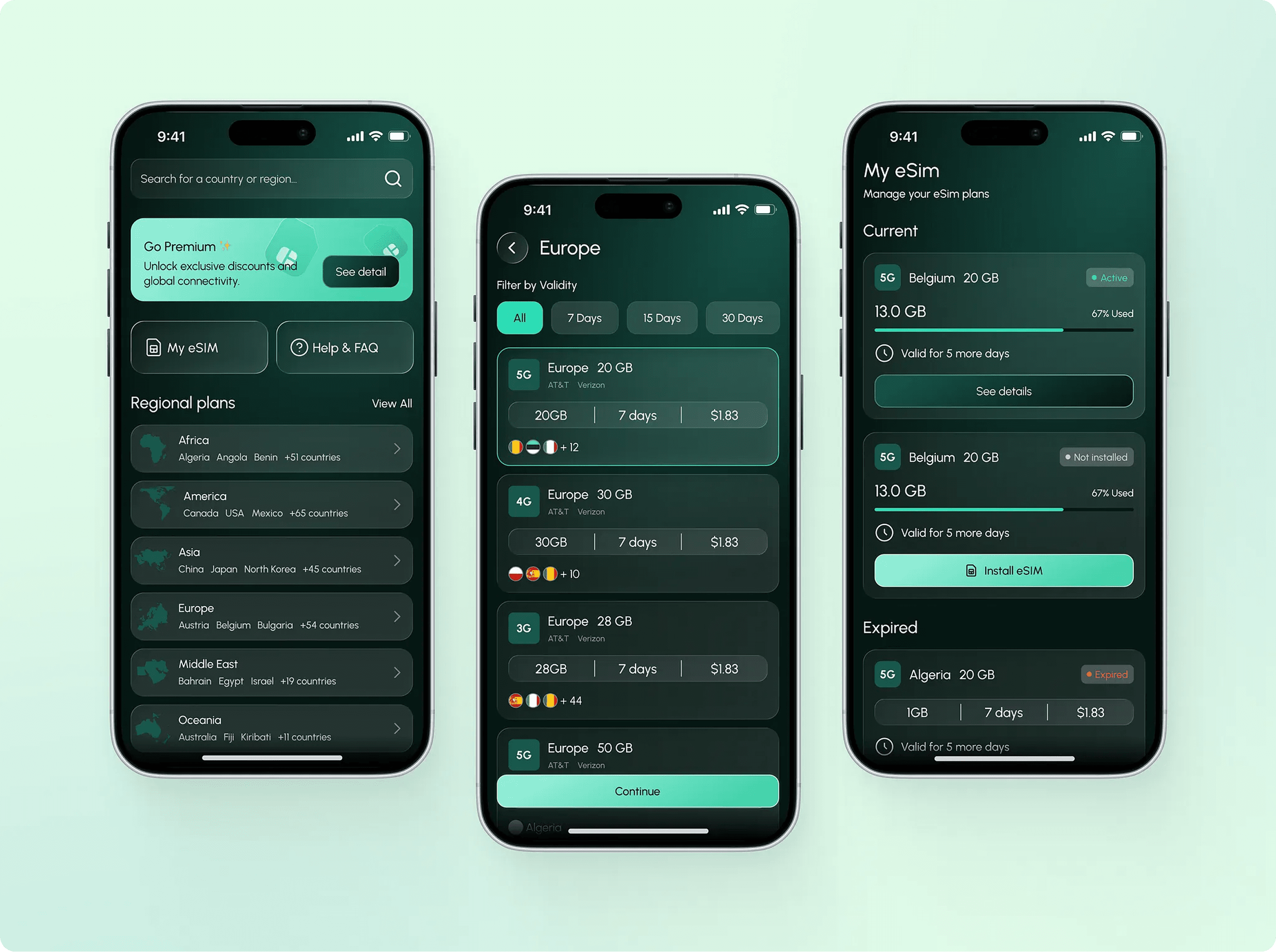
The home screen opens with one search field and splits plans into Countries and Regions. Regional plans show flags of included countries up front, and filters by data, validity, carriers, network tech and features narrow the list in seconds.
- UX
2. Plans That Are Hard to Compare
Data amount, validity, networks, speed, calls, SMS and hotspot support all affect the right choice, but users rarely understand these terms.
Solution:
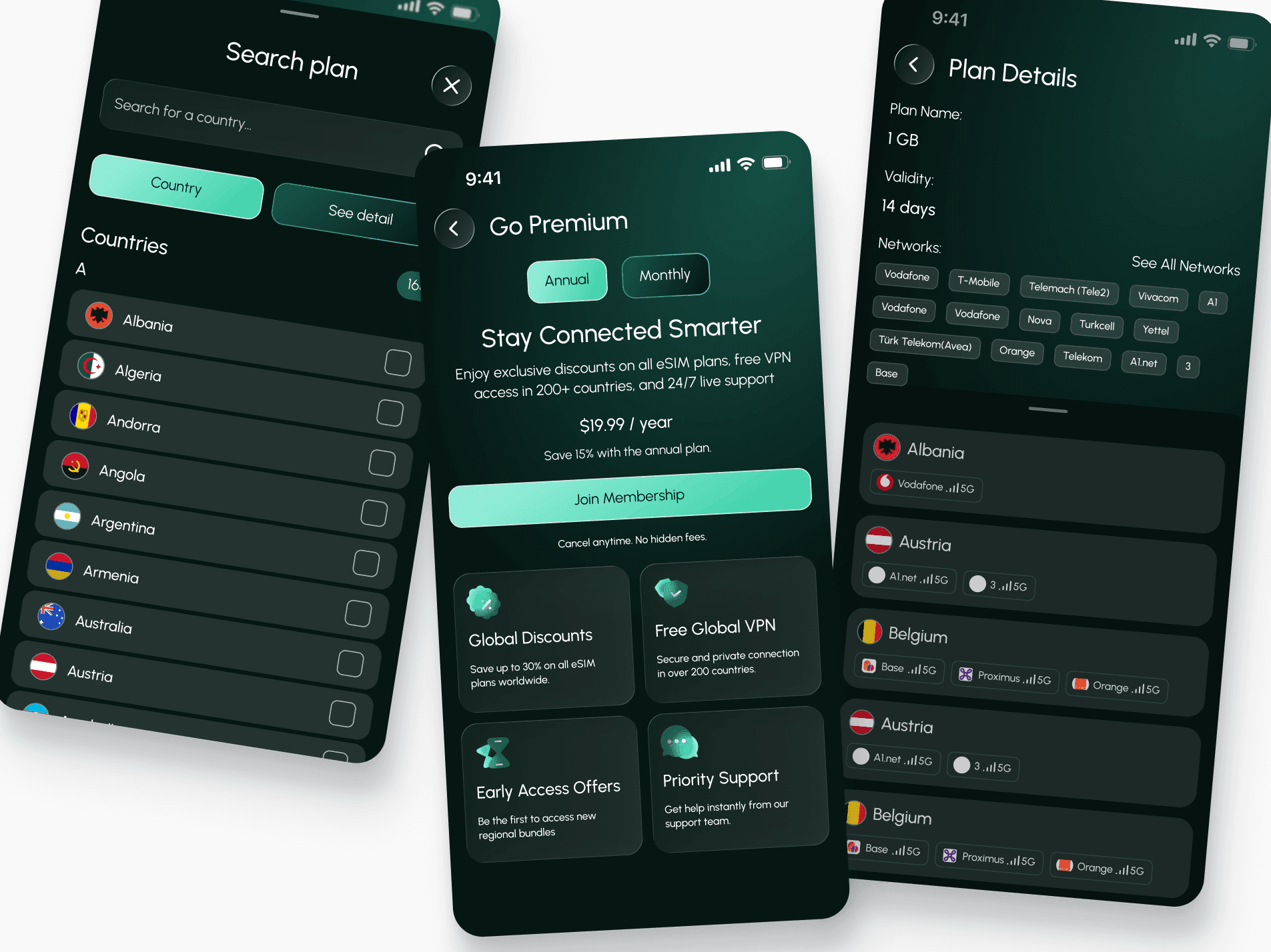
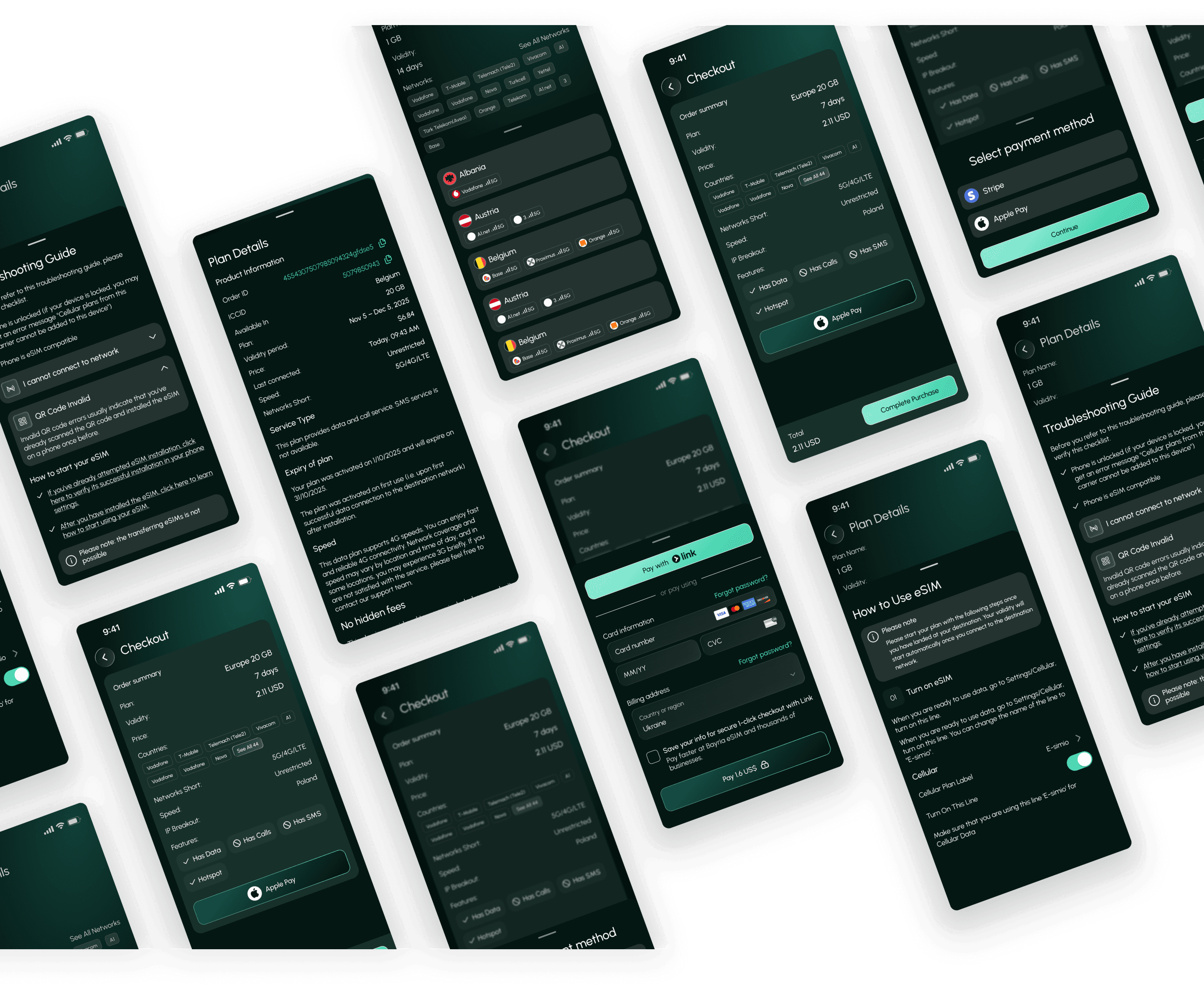
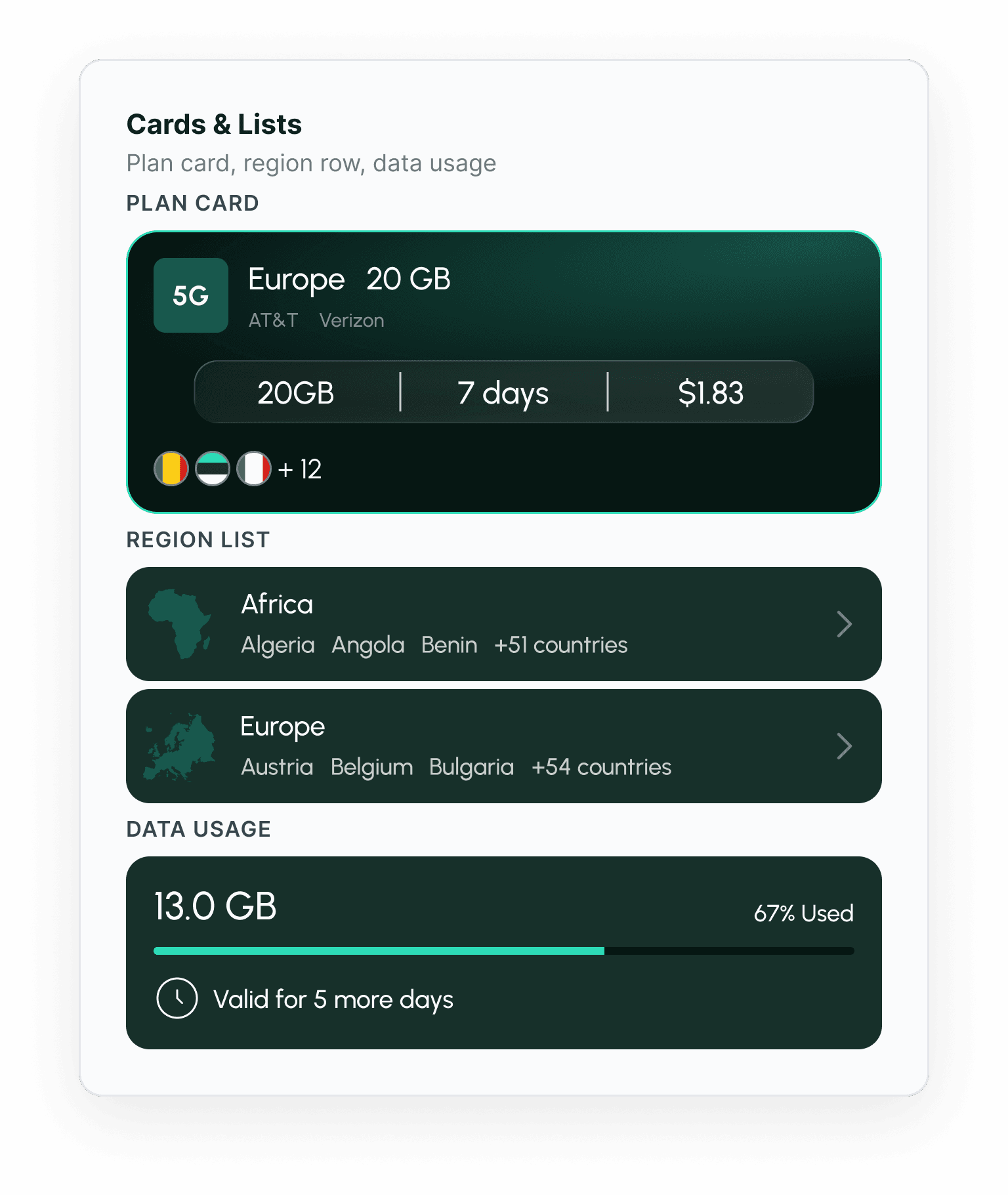
Every plan card shows data, days and price at a glance. Plan Details lists networks, 5G/4G/LTE, speed, IP breakout and features as simple yes/no chips, so users know exactly what they pay for.
- UX
3. eSIM Installation Feels Technical
Many users have never installed an eSIM. QR codes, device settings and "turn on this line" steps cause drop-off and support tickets.
Solution:
In the redesign, users get a "Your eSIM is ready" screen with a QR code and an Install now button. A step-by-step How to Use guide mirrors the phone's own Settings screens, so users recognize each step.
- UX
4. Anxiety About Data Running Out Abroad
Travelers worry about running out of data or a plan expiring at the wrong moment, with no easy way to check.
Solution:
My eSIM shows remaining data with a progress bar, days left and last connection time. Push notifications warn about low data and upcoming expiry, and a one-tap top-up ("Add 1GB for $1.99") solves the problem in place. Expired plans offer a quick renew.
- UX
5. Support Load From Activation Issues
Invalid QR codes, locked phones and network connection errors would flood support if users had nowhere to turn.
Solution:
A built-in Troubleshooting Guide covers a pre-check list and the most common errors. FAQ and live chat support sit one tap away for anything the guide doesn't solve.
- UX
6. A Subscription That Must Earn Its Place
The business needed recurring revenue, but a paywall in the way of a quick purchase would hurt conversion.
Solution:
Premium ($19.99/year) is offered as an upgrade, not a gate: up to 30% off all plans, free VPN in 200+ countries, early access to regional bundles and priority support. Members see discounted plans highlighted across the app.
Wireframes
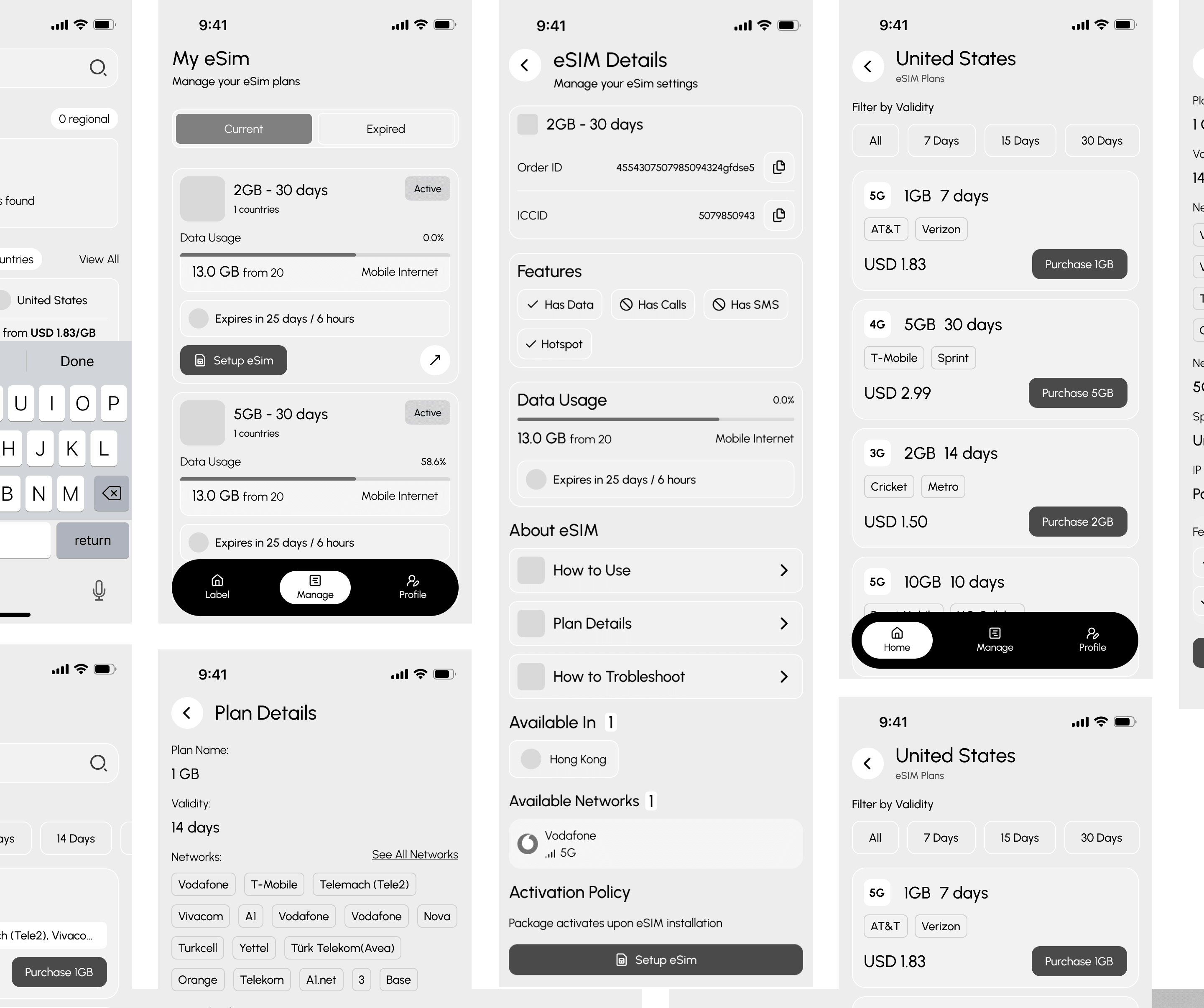
We created high-fidelity wireframes for the core platform flows, allowing us to define hierarchy, user actions, navigation, and screen relationships early in the process.
Design process
Before moving into visual design, we explored the competitive landscape and analyzed how similar social media and AI content tools structure their products.

UX Audit & Competitor Research
Audited the existing app and analyzed leading travel eSIM apps to find market standards, common friction points in purchase and activation, and gaps to close.

User Journey & Flows
Mapped the journey from search to purchase, QR installation and first connection abroad, plus top-up, renewal and Premium upgrade.

Information Architecture
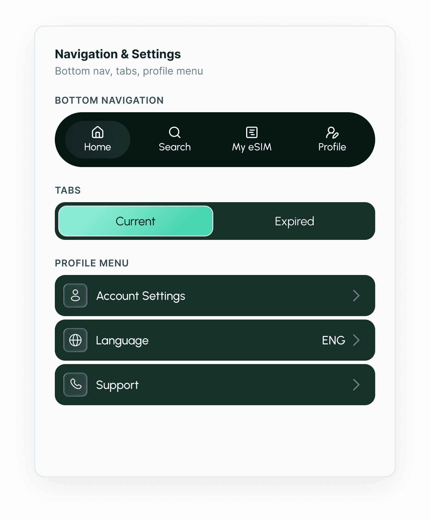
Structured the app around four tabs: Home, Search, My eSIM and Profile.

Wireframing & Edge States
Redesigned every screen with loading, empty, no-results, expired and error states, so nothing is left to guesswork in development.

Component System
Built reusable components for plan cards, filters, data-usage bars, feature chips and settings rows.

Development Handover
Delivered 45+ connected screens with flows and documentation, ready for UI design and development.
Project colours & typography
A clear process is part of the product. Here is how we work with you from first call to ongoing support, with feedback and validation built into every step so nothing is designed in a vacuum.
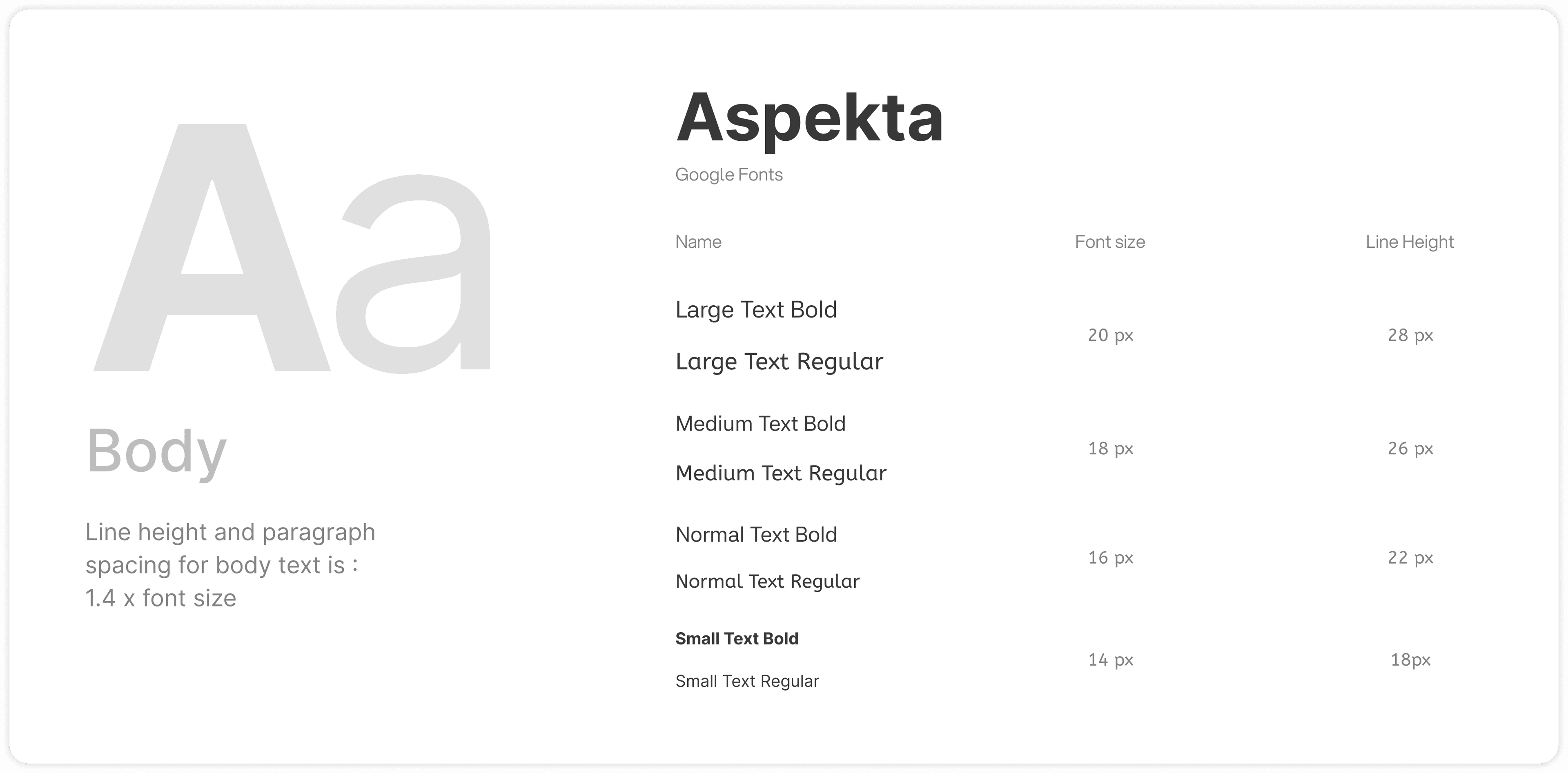
- 3AE991
- FFFFFF
- F1D35A
- 18584D
Key Product Screens
The first stage focused on simplifying a complex commercial workflow and defining a clear hierarchy between data, AI insights, recommendations, and actions.
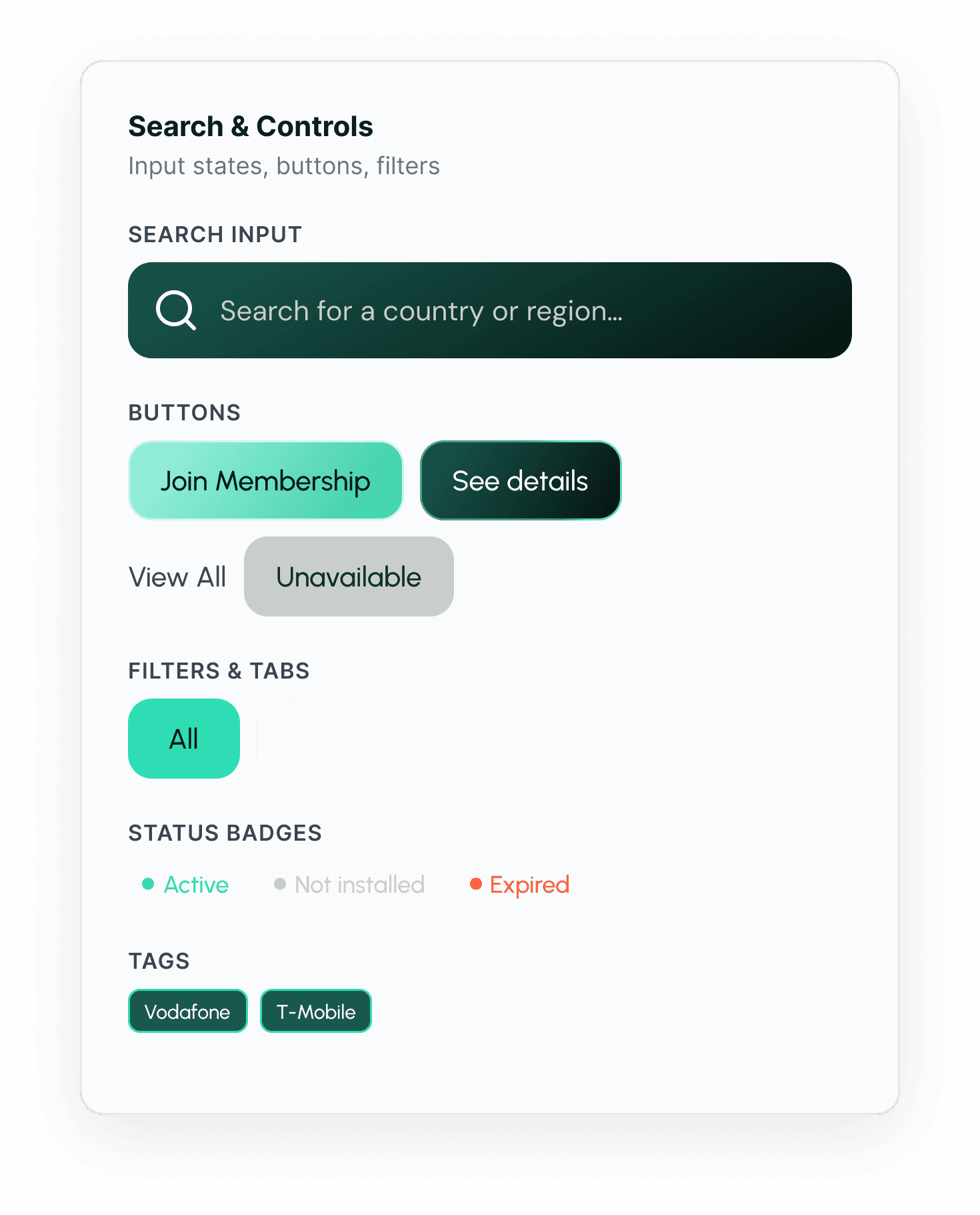
UI & Elements
eSIM uses a comprehensive UI kit built on Material UI, covering buttons, inputs, status indicators, financial components, tables, filters, and navigation elements.
Results
The redesign turned a confusing eSIM app into a clear, guided flow from plan search to activation. Travelers now find, buy and install an eSIM in a few taps, and track data and expiry without contacting support.


45+ Screens
The full app redesigned, from sign-up to eSIM activation.

165 Countries
Country and regional plans searchable in one place.

QR Install
Purchase to installed eSIM in a few taps, with a guided setup.

3 weeks Delivery
From UX audit to development handover in a tight timeframe.