Why Users Abandon Your Payment Flow
Onboarding gets all the attention in fintech product discussions. But transaction abandonment is where the revenue actually leaks. A user who completes onboarding, funds their account, and then bails at the payment confirmation screen costs you more than a user who never signed up at all. You've already absorbed the acquisition cost, the KYC overhead, the infrastructure. And then they left because your back button wiped their IBAN entry.
That's not a retention problem. That's a UX bug with a dollar value.
The back button kills more transactions than bad marketing
Picture this: a user is mid-transfer, filling out recipient details for an international wire. They've entered the beneficiary's name, IBAN, and SWIFT code. They go back one step to check the send amount or verify the source account. When they return, the form is blank.
They quit. Not because of your fees. Not because of trust issues with your brand. Because you made them type a 34-character IBAN twice.
This is the single most avoidable cause of transaction drop-off in money transfer apps, and it's more common than it has any right to be. The fix isn't complicated: persist form state across navigation. Draft-save recipient data the moment a user begins entering it. If someone types a SWIFT code and navigates away, that data should survive. If they close the app and return within a reasonable session window, it should still be there.
A back button should mean "let me review what I've done," not "let me start over." Multi-step flows for SWIFT/IBAN transfers, new recipient onboarding, and multi-currency sends all need to treat partial data as valuable, because it is.
Saving recipients after a successful transfer is the natural extension of this logic. If someone sends money to their landlord in Germany once, they'll almost certainly do it again. Prompting users to save recipient details post-transaction, with a single tap, and then surfacing those saved recipients at the start of the next send flow directly reduces the friction that kills second and third transactions. Users who save a recipient are materially more likely to become high-frequency transactors. That's a retention metric worth tracking explicitly.
Check our latest Case Study, where we solved the problem of Complex Financial Flows.
Hidden fees are not a business model. They're a churn driver.
There's a specific moment in every international transfer where a user's trust either holds or breaks. It's when they enter an amount, see an exchange rate, and then wonder whether that rate is the one they'll actually get or a teaser before the real fees appear on the next screen.
If you're still surfacing fees only at confirmation, after making the user walk through a full transfer setup, you're training your users to distrust your product. Many will abandon at confirmation not because the fees are unacceptable but because the surprise is. The number they see doesn't match their mental model of what the transaction should cost. That gap is the problem.
The standard this market has moved toward is real-time fee display on the amount entry screen. Users enter a send amount and immediately see the exchange rate being applied, the platform fee, and the recipient's expected payout in local currency. No mystery. No reveal at the end.
Most apps still miss one critical detail: users often think in terms of the end amount, not the send amount. Someone sending money to a family member in Mexico needs to cover rent, which costs 8,500 pesos. They don't want to calculate backwards from dollars. A "recipient receives" input mode, where the user enters the target amount and the app calculates what they need to send, is a functional requirement at this point. Apps that support both directions of input see meaningfully lower abandonment on the amount entry step.
Currency conversion UX also needs to handle rate volatility honestly. If the rate shown is locked for 30 seconds, say so and show the timer. If it's indicative and will update at settlement, say that too. Users who understand the rules of your rate display are less likely to panic when a number shifts between steps.
The confirmation screen is where editing goes to die
Most fintech apps treat the confirmation screen as a read-only receipt before the transaction executes. This is a mistake.
A user who reaches confirmation and realizes they entered the wrong amount, or selected the wrong source account, has two options in most apps: confirm something wrong, or go back and risk losing their progress. Neither is good. The better design is inline editing at confirmation. Amount, recipient, source account, and transfer note should all be editable directly from the summary screen. The user should be able to tap the amount, change it, and see the fee and recipient payout update in real time before confirming, without re-navigating the full flow.
This matters especially for crypto exchanges and multi-currency platforms where the relationship between inputs and outputs isn't obvious. A user who can see all the variables and adjust them in one place will confirm with confidence rather than anxiety.
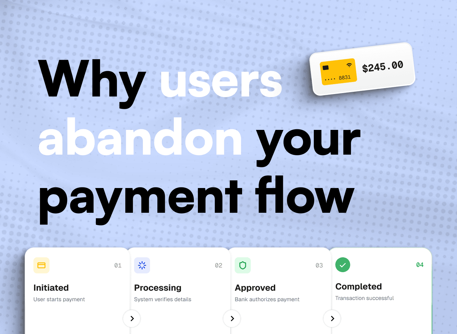
Post-transaction controls are the other half of this equation. Once a transfer executes, the user should be able to see its status at a granular level: initiated, processing, received. For transfers not yet processed, a cancel option needs to be visible and accessible, not buried. A user who knows they can cancel within a window is more willing to initiate. Removing that safety net doesn't protect your operations; it reduces conversion.
Repeat and recurring payment options belong on the transaction status screen. Not in a separate product settings section. The highest-intent moment to set up a recurring transfer is immediately after a successful one. If the user just paid their rent manually and the experience was smooth, a single tap to make it recurring will convert at rates that a settings-page CTA will never approach.
Three metrics that tell you your transaction UX has a problem
Not sure whether your transaction flow has UX debt costing you real revenue? Three product metrics will surface it quickly.
First, look at your step-completion funnel by step, not just entry-to-completion. A drop on the recipient entry step points to form complexity or IBAN/SWIFT UX friction. A drop on the amount step points to fee transparency or currency confusion. A drop at confirmation is almost always an editing, trust, or surprise-fee problem.
Second, segment repeat transaction rate by whether the user saved a recipient after their first transfer. A large gap in 30-day retention between users who saved a recipient and those who didn't is a clear signal that your recipient-save prompting is too weak or poorly timed.
Third, track abandonment rate specifically for back-navigation events. Users who navigate backwards and then abandon at a meaningfully higher rate than users who complete without going back almost certainly have a data persistence problem on their hands. Fixable in a sprint.
Check our Case Study, where we solved similar problems.
What fixable actually looks like
The transaction UX problems described here aren't design philosophy disagreements. They're specific implementation choices with measurable, reversible effects on abandonment rate. Persistent draft saving is an engineering decision. Real-time fee display is a design and API decision. Inline editing on confirmation screens is a product decision.
None of these require a redesign. Most can be addressed incrementally, one step at a time, starting with whichever metric is bleeding the most.
Building a payment platform, neobank, or crypto exchange with a transaction completion rate lower than you want? Start with a structured audit of your flow by step, paying explicit attention to what happens to user data when they navigate backwards. That single question will surface more fixable issues than most other audits combined.
At Creava, transaction flow UX audits are something we offer as a starting point for exactly this kind of work. If your completion numbers are soft and you're not sure which step is the culprit, a structured review tends to find the answer faster than instrumentation alone. Reach out if that's useful.