10 Signs Your SaaS or Platform Looks Templated
Most founders who vibe-coded their SaaS or assembled it with AI tools know, somewhere in the back of their mind, that the design feels a little off. They just can't name it. The app works. The features are real. But demos go quiet, trial users churn after day two, and something about the product just doesn't land with serious buyers.
The problem usually isn't the product. It's that it looks like a hundred other products, because it was built from the same set of defaults. AI-generated UIs and no-code-adjacent "vibe coding" workflows pull from the same component libraries, the same font stacks, the same layout logic. The result is a SaaS product that signals "prototype" rather than "production" to anyone who's seen more than three B2B tools in their life.
Here are ten specific signs your SaaS looks templated, and what each one is actually costing you.
1. Every button, card and input looks like it came from the same library
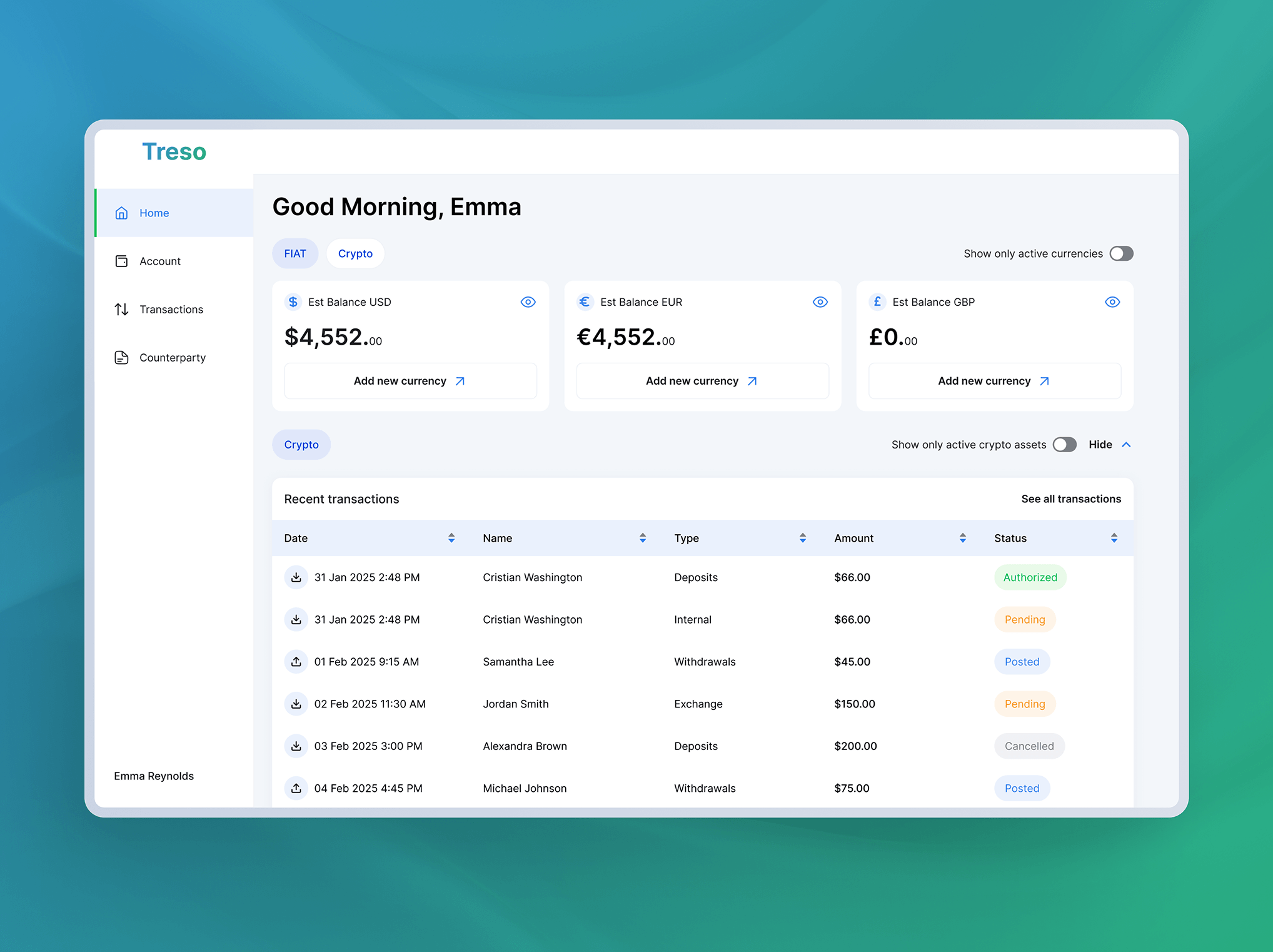
It did. Material UI, ShadCN, and Chakra UI are everywhere in AI-generated and vibe-coded products. They're not bad libraries, but using them without customization means your interface shares its visual DNA with thousands of other apps. B2B buyers have pattern recognition. When your dashboard looks like a default Google admin panel, you look like a tool that hasn't shipped version one yet.
2. One accent color does all the heavy lifting
Pick any AI-scaffolded SaaS and you'll almost always find a single accent color, usually blue, sometimes teal, used for every primary button, every link, every active state, every highlight. This isn't a design system. It's a placeholder. A real design system has a hierarchy of colors that communicate meaning: primary actions, destructive actions, status, success, warning. When everything's the same blue, users have no visual grammar to read. That's a usability issue before it's even an aesthetic one.
3. Your icons are emojis or Feather icons at default size
Emoji as interface elements is a fast path to looking unfinished. Feather Icons at their default 24px weight, used without any customization of stroke, color, or sizing relative to your type scale, look generic regardless of how thoughtful the underlying feature is. Icons should reinforce brand character. If your icon set could be swapped with any other SaaS's icon set without anyone noticing, you don't have a design system. You have defaults.
4. Your font is Inter. Just Inter.
Inter is a legitimately excellent typeface. It's also the Helvetica of the 2020s: ubiquitous to the point of invisibility. If your entire product, marketing site, onboarding, dashboard, emails, all of it uses Inter at default weight with default tracking, you're relying on copy alone to carry personality. Typography is one of the cheapest places to establish a distinct visual identity. A single custom display font for headings changes how a product feels without a single layout change.
5. Every page in the app shares the same template
Sidebar, header, content area, repeat. In a deeply functional SaaS with complex workflows, this can be appropriate, but only if the template is intentional and there are deliberate deviations where the user experience demands them. In most vibe-coded products, the identical template persists because nobody made a decision to break it. Settings pages look like data pages look like empty states. Users can't build a mental map because there's no visual differentiation to map. It's one of the clearest structural contributors to poor SaaS usability.
6. Your marketing homepage is blocks all the way down
Hero block. Features block. Testimonials block. Pricing block. Footer. This is the homepage equivalent of a Word document template. It's not that these sections are wrong. It's that they're assembled with zero connective tissue. No visual storytelling, no progressive disclosure of complexity, no moment where the design reinforces the product's specific value proposition rather than just containing it. Homepage blocks that look like they came from a Webflow template, because they did, don't convert serious B2B buyers who are evaluating five other tools the same afternoon.
7. There are no interactive or animated elements that mean anything
Not "add an animation because animations are nice." Meaningful interactivity means that when a user completes a key action, something in the interface confirms it mattered. Micro-animations on success states, progress indicators that actually communicate progress, transitions between workflow steps that orient the user rather than just move them. These are the elements that make a product feel finished. Their absence is one of the clearest markers of an AI product that was assembled rather than designed. Flat, static interfaces feel cheap in 2025 even if every individual component is technically correct.
8. Your empty states are a paragraph of text
Empty states are prime real estate. When a user has no data yet, no connected integration, no completed workflow, you have their full attention and a clear chance to direct their next action. Most AI-built SaaS products fill this space with a text label or a generic illustration from a free library. A designed empty state has a specific illustration or icon, a concrete CTA, and often some context about what the space will look like when it's full. Getting this right takes about four hours of design time. It materially affects activation rates.
9. Nothing in the dashboard would make a user stop and look
Open your dashboard. If you can scan it in under three seconds and leave without any single element pulling your attention, you've got a memorability problem. This isn't about decoration. It's about information hierarchy. A designed dashboard has at least one element that communicates value at a glance: a chart that shows trend, a number that represents something meaningful to the user's goals, a visual indicator of progress. When every piece of data sits at the same visual weight, nothing registers. Users close the tab and don't come back.
10. You have no unique graphic or branding asset anywhere in the product
No custom illustration style. No product-specific icon set. No branded data visualization approach. No mascot, no signature pattern, no distinct moment in the UI that could only belong to your product. This is the summary symptom. Every other item on this list compounds into a product that has no visual fingerprint. In a crowded SaaS market, visual fingerprints are a business asset. They're how users remember you, how they describe you to a colleague, how your screenshot looks different from every other screenshot in a G2 comparison grid.
What this actually costs
These aren't aesthetic complaints. They're conversion problems.
A B2B buyer evaluating your SaaS against two competitors is running a rapid credibility calculation. Generic design reads as: team didn't invest in this, product might not be maintained, I'm not sure I trust this with my team's workflow. That's a real heuristic that real buyers use, whether or not they consciously articulate it.
Retention compounds the problem. Users who don't find the interface memorable or satisfying during onboarding don't develop the kind of product attachment that drives expansion revenue. The SaaS customer journey has multiple moments where design either builds or erodes trust: the marketing site, the signup flow, the first dashboard view, the first empty state. AI-generated products tend to drop the ball at all of them simultaneously.
The fix isn't a full redesign. For most products at this stage, a structured SaaS product audit is the correct starting point. An audit maps exactly which of these issues are present, prioritizes them by conversion impact, and produces a concrete remediation plan that doesn't require rebuilding the product from scratch. Some of the highest-impact changes, typography, color hierarchy, empty states, a single memorable visual element on the dashboard, can be addressed in days, not months.
At Creava, we run exactly this kind of audit for SaaS founders who've built something real but know the design is holding them back. If you read this list and recognized your product in three or more items, that's the signal. The credibility gap is fixable. It doesn't fix itself.
We offer a free initial UX consultation. It usually takes about 45 minutes and ends with a prioritized list of what to fix first.