10 Signs Your MVP Is Actually Ready to Launch (And Most Startups Miss Half of Them)
Most founders declare their MVP launch-ready when the backend stops crashing and the main feature works. That bar is too low. It's why so many SaaS products churn out 60-70% of their trial users in the first two weeks. Launch confidence shouldn't come from the fact that the product works. It should come from knowing the product works for someone specific, guides them to value, and doesn't quietly abandon them at three different dead ends along the way.
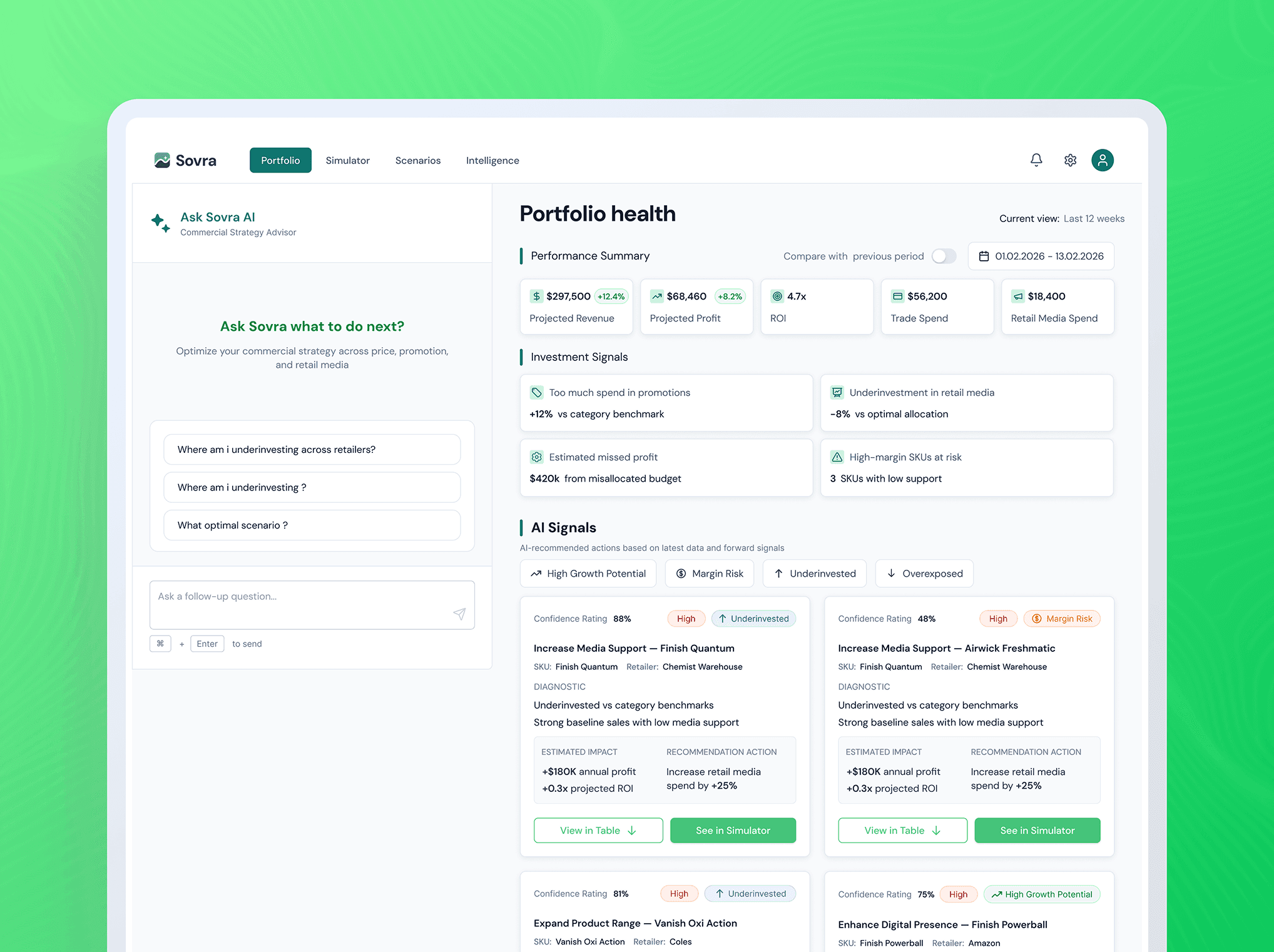
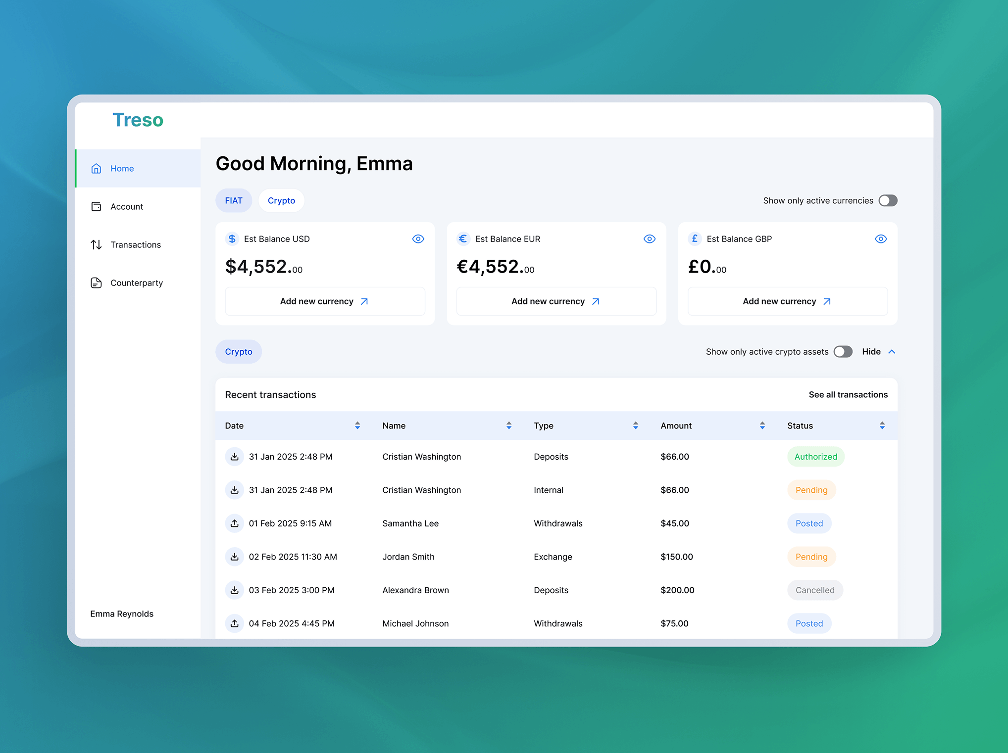
This is the checklist we run through at Creava before telling any client they're ready to go live. It's drawn from dozens of MVPs, including work with FinTech product and RetailTech product, and it splits into three categories: structural UX completeness, strategic product readiness, and external validation. Check all ten honestly and launch. Miss any of them and you'll find out why users are leaving before they ever have the chance to pay you.
Part 1: Structural UX Completeness
These are the things users hit before they ever see whether your core product is good.
1. Every flow has an exit or a next step, no dead ends.
A dead end is any screen where a user can take the wrong action, hit an error, or complete a step with nowhere obvious to go next. It sounds elementary. In practice, nearly every MVP we audit has three to five of them hiding in edge cases: a failed payment with no retry option, an empty state with no prompt, a settings page with a back button that returns to the wrong screen.
During the FinTech product onboarding audit, we found that new users who tried to invite a team member before completing their own profile hit a validation error with no explanation and no path forward. Roughly 40% of users who hit that screen didn't come back. One screen. One dead end. Significant churn. Fixing it took a day of development work.
Walk every flow as a first-time user, including every error state. If you don't know what happens when something goes wrong, your MVP isn't ready.
2. The three key flows work without guidance.
Every SaaS product has three flows that matter most at launch: onboarding, core feature execution, and upgrade or subscription. If a user can't complete all three without help documentation, a support prompt, or a call from your team, you don't have a market-ready product. You have a demo.
Test this with five people who've never seen the product. Don't coach them. Watch where they pause. Where they pause is where you have work to do.
3. Onboarding ends at a real "aha moment," not a dashboard.
Dropping new users on a blank dashboard after signup is the most common onboarding failure in early SaaS. Users land, see nothing populated, and leave. Onboarding should end the moment a user has experienced the product's core value, not the moment you've collected their billing information.
For a project management tool, that might be the first time they see a task move across a board. For an analytics product, it's the first time they see their own data visualized. Define that moment precisely, then design backward from it.
Part 2: Strategic Product Readiness
This is where MVP validation gets more nuanced, and where most product discovery frameworks stop short.
4. The ICP's top three pain points are explicitly addressed.
Not generally addressed. Not adjacent to being addressed. Explicitly, specifically, demonstrably closed. If your ideal customer profile targets a solo founder managing client projects across five freelancers, your MVP needs to handle that exact scenario, not a simplified version you intend to expand later.
Your product discovery process should have produced a clear ranking of pain points. Before launch, pressure-test whether the current feature set actually resolves them or just acknowledges them.
5. Analytics events are tracking the decisions that matter.
You can't improve what you can't see. Before launch, you need event tracking on every action that signals whether users are finding value: first feature use, onboarding completion, invitation of a second user, first export, return visit within 72 hours. Not pageviews. Actions.
This is a startup validation problem as much as a technical one. Founders frequently launch with only top-level analytics, sessions, signups, and no insight into what users are actually doing. Three months later they're guessing. Set up the event tracking before a single real user touches the product.
6. The subscription or upgrade flow converts without friction.
Trial-to-paid conversion is where revenue either happens or doesn't. If your upgrade flow requires more than three clicks, asks for information you already have, or routes through a third-party payment page that looks completely disconnected from your product's visual language, you're actively suppressing conversions.
Free trial conversion rates in B2B SaaS average around 15-20%. Products with simplified, in-context upgrade flows tend to sit at the high end of that range. Products that send users to an uncustomized Stripe-hosted checkout page tend to sit at the low end. Friction explains almost the entire difference.
7. The free tier delivers genuine value, not a teaser.
There's a difference between a free tier that builds trust and one that frustrates users until they pay. If the free version doesn't give users enough to actually see its value, you're not running a freemium model. You're running a free trial with no clock, which converts at roughly the rate of a billboard.
One useful test: does the free tier answer the question "Does this product solve the problem I came here to solve?" If discovering that answer requires a paid plan, you've made product validation significantly harder for yourself.
Part 3: External Validation and Visual Polish
No amount of internal review replaces watching someone else use your product.
8. At least five early adopters have tested it and given structured feedback.
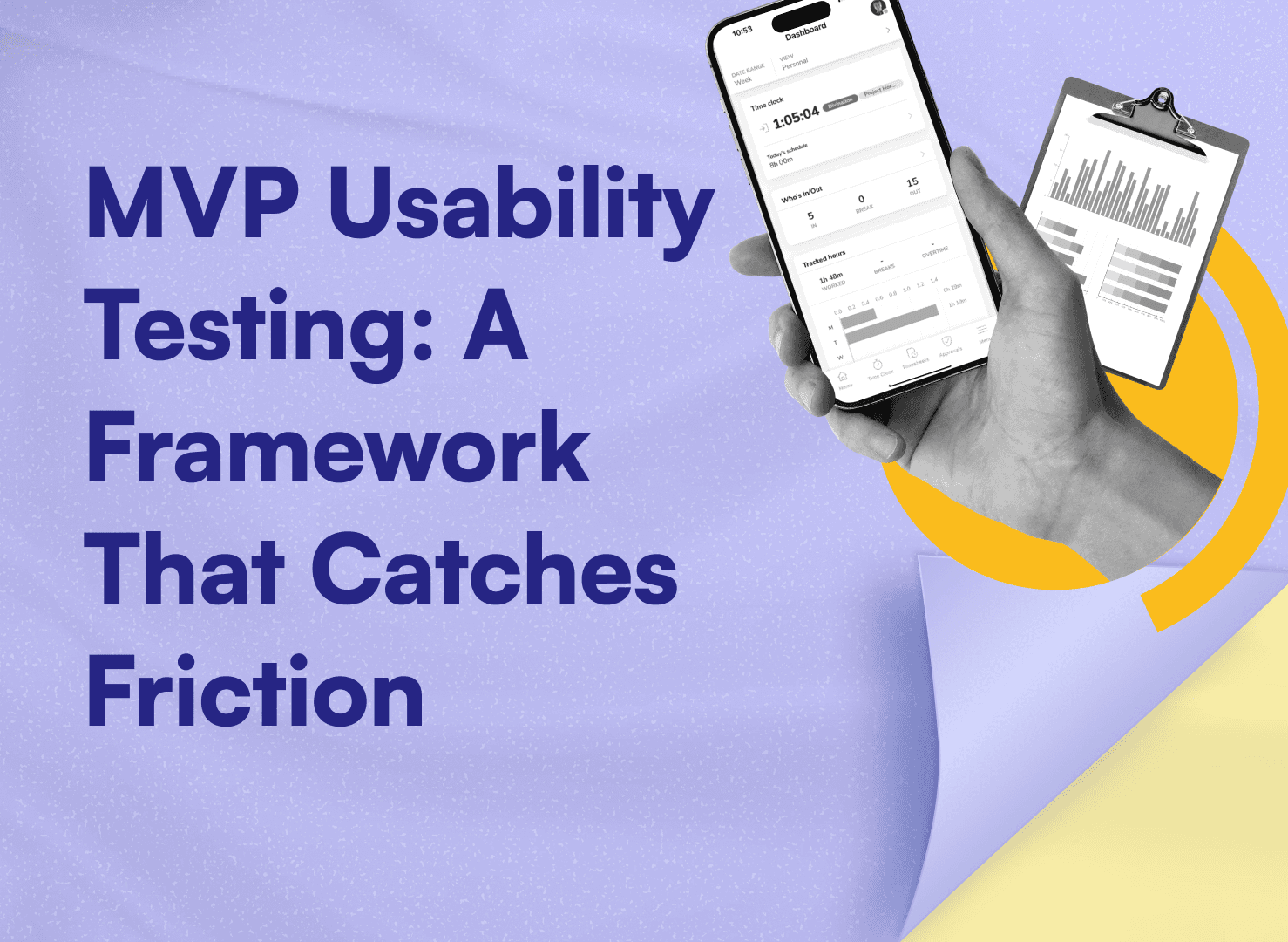
MVP usability testing doesn't require a UX research firm or a lab. It requires five real humans who fit your ICP, tasks to complete without your guidance, and a structured way to capture where they struggled and what they said. Pre-launch testing consistently surfaces issues that internal teams are too close to see, because they already know where everything is.
With RetailTech product, we ran five user sessions before launch and identified that users were consistently misreading a key dashboard metric because the label was ambiguous. The metric tracked the right thing. The label made it look like it was tracking something different. Users were losing confidence in the product's accuracy before finishing their first session. Pure QA would never catch that.
9. AI-generated UI artifacts have been removed or refined.
If you've used AI tools to accelerate design (and most teams have), do a specific review for artifacts: stock-looking placeholder imagery, inconsistent icon weights, text that's slightly too long or oddly phrased, layouts that feel template-generic rather than purposefully designed. Users don't always articulate this. They just feel like the product wasn't built for them.
This isn't cosmetic. It's about trust. A brand-new product with no reputation has nothing but its presentation to establish credibility. Generic design actively undermines that.
10. The overall design is clean, specific, and faintly inspiring.
Faintly inspiring is a high bar for an MVP. It still matters. Users choosing between your product and an established competitor aren't just comparing features. They're asking themselves whether they believe in the product. Considered typography, a coherent color system, UI copy that sounds like a person wrote it for this specific context: these details create that belief.
Clean means nothing extraneous. Specific means it looks like it was made for the exact person you're trying to reach. Inspiring means users finish their first session thinking "this could actually work" rather than "I suppose this will do."
How to Use This
Run this list as a startup launch checklist before you open signups or run paid acquisition. Be honest about it. A "mostly there" on dead ends isn't a pass. "We're planning to add tracking post-launch" on analytics isn't a pass either.
Fixing these things before launch costs a fraction of what it costs to reacquire users you'll churn if you don't. Early-adopter feedback collected before launch is also dramatically cleaner than the noise you'll try to interpret from real-world drop-off data once the product is live.
If you want a structured review of where your MVP stands across these ten criteria, Creava offers MVP audits specifically designed for teams preparing to launch. Even without an outside perspective, this checklist is specific enough to score yourself honestly. That score will tell you more than most launch plans will.